Hello everyone!
The credibility of Kat Von D might have taken a hit for her stance on vaccinations, but we cannot deny that her makeup brand is still one of the most successful in the industry after many years into the beauty business, owing to the high-performance and cruelty-free products in wildly unorthodox colours that it has been producing.
To celebrate a decade of fearless artistry, Kat Von D Beauty dropped a 10th Anniversary collection and in honour of her Latinx heritage, the launch was planned to coincide with Cinco de Mayo (5 May), a culturally and historically significant day for the Mexicans. The line includes an eyeshadow palette, a Metal Crush Highlighter (Gold Skool), Studded Creme Kiss Lipstick (Santa Sangre), an Everlasting Glimmer Veil Liquid Lipstick (Gold Skool), a brush set, Tattoo Liner (Trooper) and a train case comprising everything in this gold-drenched lineup – but in very limited quantity. My eyes were set on the eyeshadow palette (though now I kinda regret not buying the gold liquid lipstick as well).. because nobody can get enough of rainbow beauty things, right?
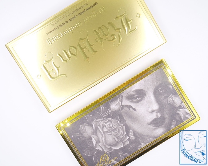
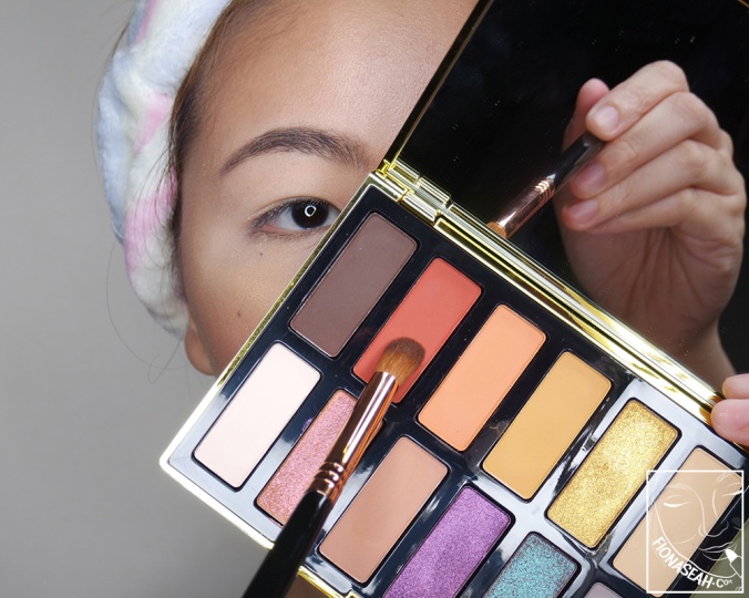
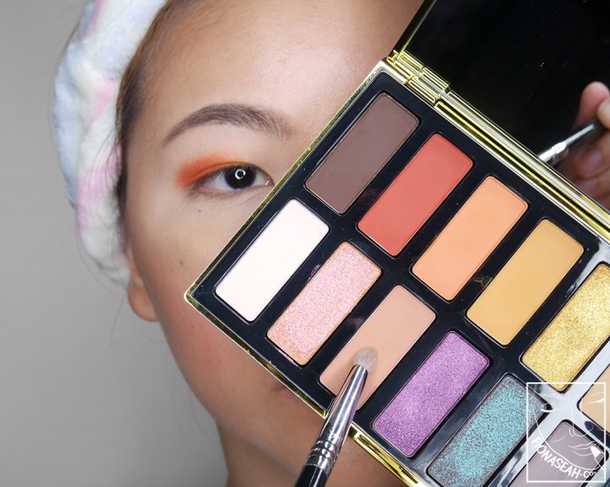
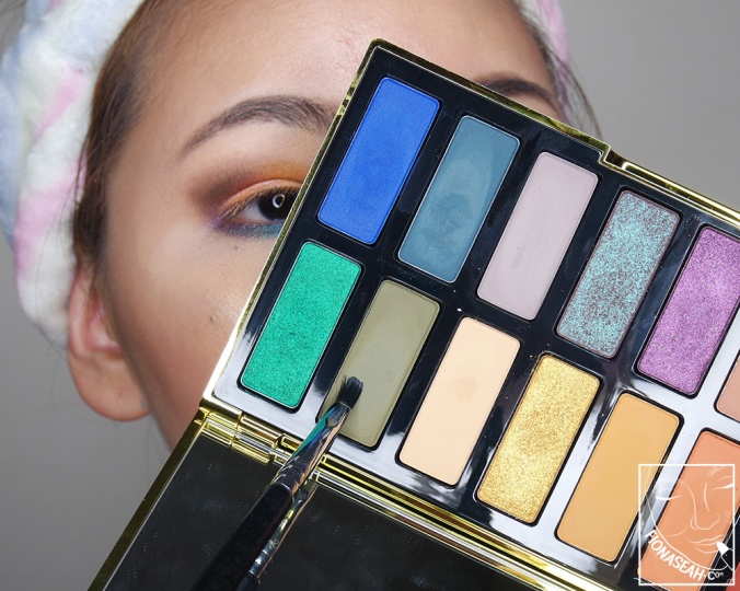
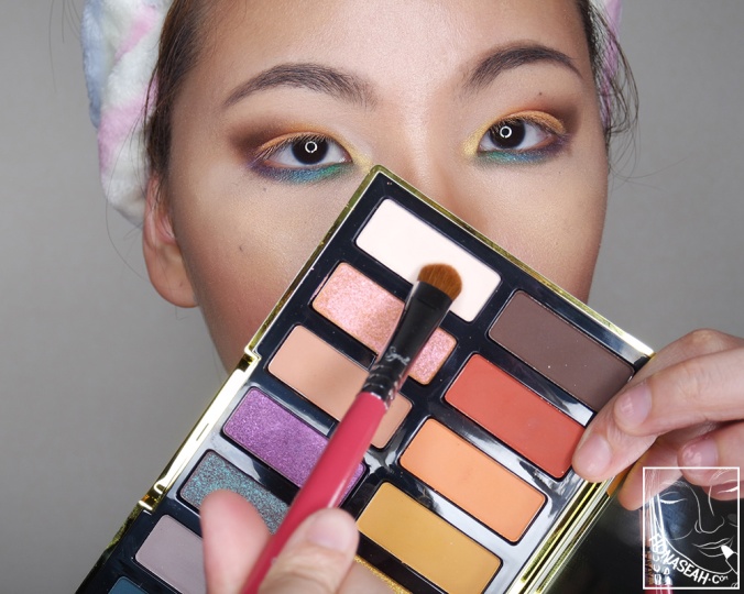
Kat Von D 10-Year Anniversary Eyeshadow Palette (US$52 / S$76)
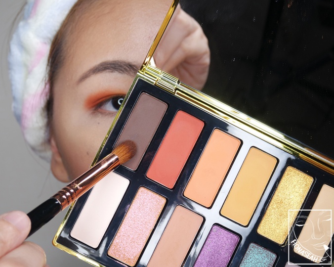
![Kat Von D 10-Year Anniversary Eyeshadow Palette [I got mine off the KVD website]](https://fionaseah.com/wp-content/uploads/2018/07/kat-von-d-10th-anniversary-palette-1.jpg?w=676&h=451)
Kat Von D 10-Year Anniversary Eyeshadow Palette [I got mine off the KVD website]
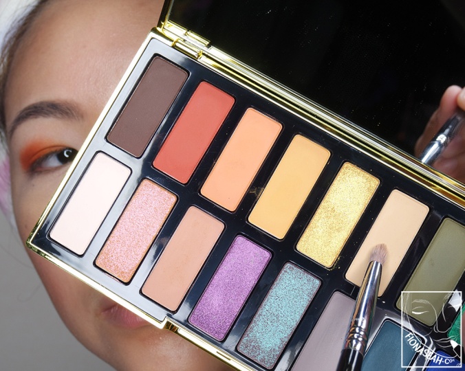
Kat Von D 10-Year Anniversary Eyeshadow Palette
Kat Von D 10-Year Anniversary Eyeshadow Palette

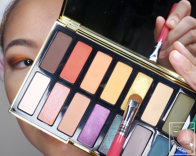
Finger and brush swatches of all shades (Click to view full size)
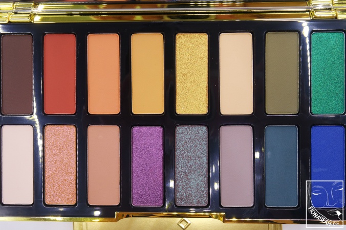
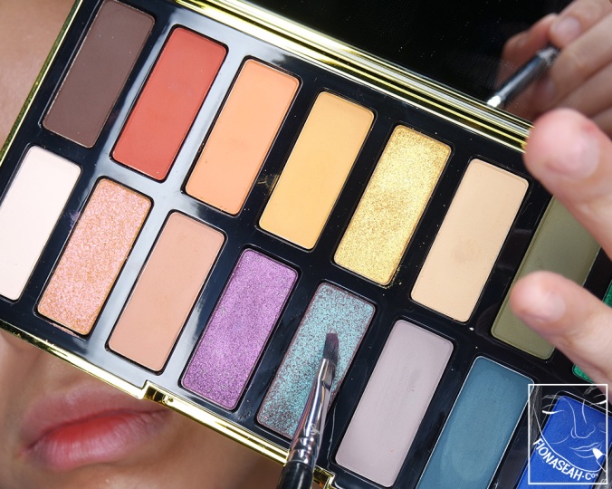
Encased in a reflective gold packaging graced by an original artwork hand-drawn by the talented Kat Von D herself, the limited-edition eyeshadow palette features 16 blendable shades (mostly of warm hues) inspired by and named after 16 of Kat Von D’s muses – people of all backgrounds, ages, genders and skin tones, some of whom had worked behind the scenes.
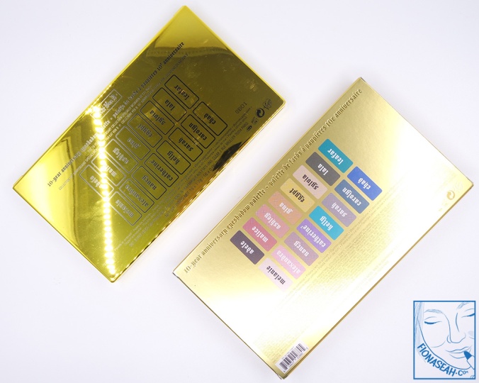
The bold selection of shades were specially handpicked for this commemorative collection, are vegan (as always) and of finishes designed to “power your self-expression with insane pigment and effortless blendability”. What I love about the palette (apart from the fact that it comes with a mirror) is that the shades are arranged almost in sequence as in the colour spectrum, and this spoke to the OCD in me. But annoyingly, their names are not printed on the palette so I had to keep referring to the box for them.
The following palettes were selected for comparison purposes due to their similarities to Kat Von D 10-Year Anniversary: ColourPop × Shayla Perception · Kat Von D Saint and Sinner. The comparison swatches shown below are the same as those on my Perception review.
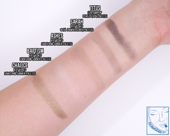
Adele is described as a chocolate brown. This deep cocoa brown has a matte finish with very sparse and unnoticeable gold shimmer. Smooth to the touch, there was amazingly no kickback when I dipped my finger or brush into the pan (which is rare for dark shades). The application was slightly sheer and streaky but was buildable to a semi-opaque coverage. When blended out, however, some of the product wouldn’t budge while those that did balled up slightly. On top of that, the overall intensity was also reduced. In its wet state, it becomes a hard film that is nearly impossible to blend. For comparison swatches, please refer to the image after the review on Malice.
Malice is described as a vermilion red. This burnt orange has red undertones and a matte finish which feels a little powdery. There was a bit of kickback in the pan when I picked it up with my brush, but it didn’t have any fallout when I applied it to my lid. This shade provided an even consistency and was easy to blend without sheering out too much so it didn’t take me long to build it to full opacity. It delivers almost the same, if not a slightly more intense payoff when used wet.
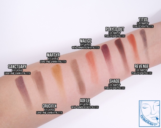
Swatch comparison for Malice and Adele
Ashley is a described as a peachy orange. This bright orange has yellow undertones and a matte finish. Finely milled to a powdery smooth texture, it goes on pigmented on bare skin without being chalky. The harsh edges can also be diffused easily without becoming muddy or sheering away. For comparison swatches, please scroll down to the review on Nancy.
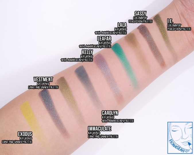
Gina is described as a mustard yellow. This matte warm yellow has orange undertones and it becomes darker (almost leaning towards orange) when more product is piled on. Finely milled with a smooth texture, this shade adheres well to the skin while providing great pigmentation. I had no issues diffusing the harsh edges when applied wet or dry. For comparison swatches, please scroll down to the review on Nancy.
Egypt is described as a gold glimmer. Infused with glitzy chunky shimmer that appears loosely scattered when applied, this muted warm gold does not feel as gritty as it seems in the pan. It goes on very smooth and pigmented on bare skin skin, delivering an opaque payoff without the need for a primer. When I blended out the colour, it didn’t sheer out or lose much of its sparkle. When used wet, the shimmer becomes more condense, enabling the shine to be a lot more pronounced. For comparison swatches, please scroll down to the review on Alexandra.
Sylvia is described as a honey beige. This pale warm beige has orange undertones and a matte finish. The payoff is mostly sheer, and in order to achieve some opacity, a lot of product have to be patted on. Like most of the shades in this palette, it has a smooth consistency which blends out seamlessly. Unfortunately, the colour is matches my skin tone too well to make any impact so I don’t see myself using it often. For comparison swatches, please scroll down to the review on Nancy.
Lala is described as an olive green. This deep moss green has yellow undertones and a semi-opaque matte finish, and is a splendid addition to my limited repertoire of green eyeshadows. But as much as I adore this shade for its uniqueness, it sadly does not perform up to my expectations. Besides having a lightly chalky consistency, it also tends to emphasise the texture of my skin and ball up when I tried to blend it out, resulting in a patchy and distressed-like texture. These issues, however, seem to minimised when product is used wet. For comparison swatches, please scroll down to the review on Carolyn.
Leafar is described as an emerald glimmer. This cool vibrant green has blue undertones and a metallic finish owing to its densely packed fine shimmer. Although pressed relatively loosely in the pan (as I could feel the product lifting off when I swirled my finger in the pan), the amount of kickback is pretty minimal. Smooth in texture, this shade adheres well to bare skin and blends out easily without affecting its intensity. It goes on semi-sheer on first pass but once more product is piled on, its opacity and vibrancy are out of this world. Leafar works beautifully dry and wet. For comparison swatches, please scroll down to the review on Carolyn.
Melanie is described as a rosy cream. Matte in finish, this pale cool beige is probably one tone away from being completely white – it is so light that it disappeared the instant I swatched it on the paler part of my wrist. This shade is mostly opaque, and it applies fairly pigmented without any fallout. I was also able to diffuse the edges easily.
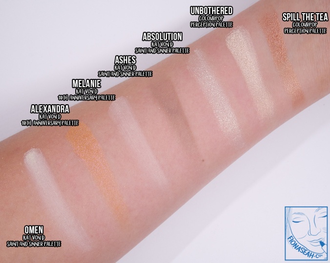
Swatch comparison for Melanie and Alexandra
Alexandra is described as a rose gold glimmer but it appears more of an iridescent orange with yellow undertones and a slight pink shift to me. This shade is the shimmery and slightly darker version of Gina although it appears more peachy in the pan. Very finely milled with a smooth and seamless consistency, this shade goes on opaque and blends out effortlessly without losing much intensity. Furthermore, a little of this product goes a long way – it delivers incredible payoff without having to jab your brush into the pan.
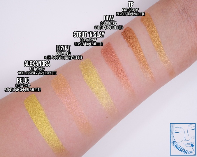
Swatch comparison for Egypt and Alexandra
Nancy is described as a taupe mauve. This muted terracotta has brown undertones and a matte finish. Finely milled to a smooth, even and endearing texture, this shade applies mostly opaque on the lid and is fairly easy to diffuse. There was some kickback in the pan, but negligible enough not to cause any mess. It does, however, tend to become increasingly greyish when more product is added atop each layer.
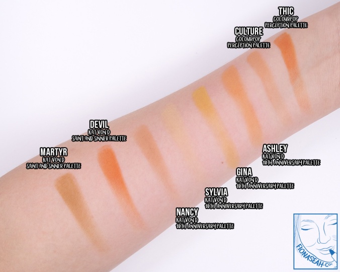
Swatch comparison for Ashley, Gina, Sylvia and Nancy
Catherine² is described as an orchid glimmer. This mid-tone lavender has pink undertones and loose shimmer which renders it a metallic finish. At certain angles, however, it appears eggplant purple with a hint of grey. This shade applies sheer and requires many layers before it stops allowing my natural skin to show through anymore. Additionally, it does not spread out very well as the product tends to concentrate at the part where the brush touches first and it didn’t budge an inch when I tried to blend it out.
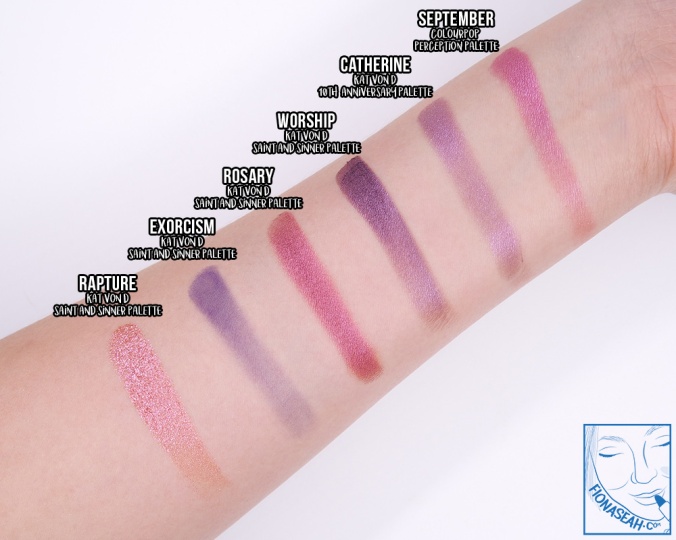
Swatch comparison for Catherine²
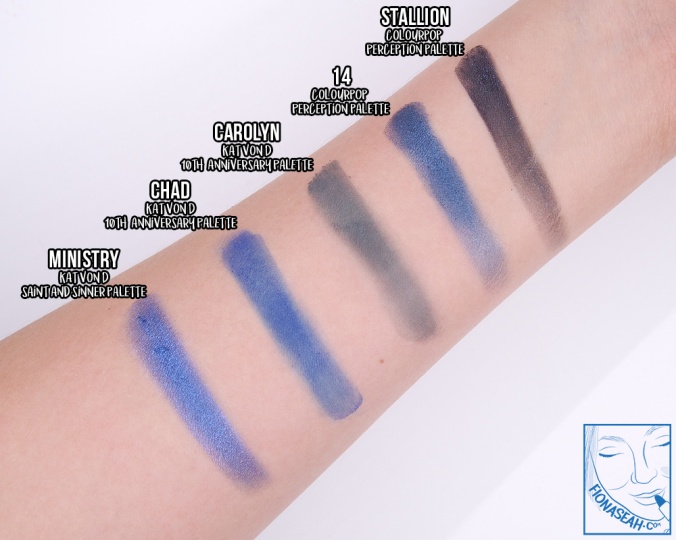
Kelly is described as a blue-brow glimmer. This warm brown has loosely scattered cyan shimmer and a duochrome finish to boot. The shift on my finger after I dipped it into the pan looked seamlessly stunning but it didn’t quite translate well on my lid – the shimmer was seemed like it was on a separate layer from the main product and the sparkle was too ostentatious for the shift to be noticeable. Packing on more product made them more cohesive until I blended it out (as the shimmer along the edges once again distanced itself from the brown). Eventually, the problem was resolved by applying the product with a dampened brush. Not only did that keep the shimmer and the brown together, it also intensified the shine. For comparison swatches, please scroll down to the review on Carolyn.
Sarah is described as a cool greige (a mix of grey and beige). This cool mauve has grey undertones and it applies sheer and streaky. The product clings on uneven surfaces and is barely buildable. But once it is blended out, it fades to nothingness. You might think that this could probably work better when used wet. WRONG! It hardened and darkened to a dirty purple when I applied it with a dampened brush and it was a Herculean task to diffuse it at all. How did this horrible shade make it into the palette?
Swatch comparison for Sarah
Carolyn is described as a muted teal but, I don’t know if it is just me but it seems a little too dark to be qualified as “muted”? This matte shade has a strong blue undertone and looked promisingly opaque on the first pass. But that excitement quickly turned to disappointment when the product started losing its intensity and sheering out (except for that little area where the brush first touched) upon being diffused. Apart from that, this shade also has a mild rubbery and stiff texture with an uneven consistency which caused it to ball up when I ran my brush through it on my lid.
Swatch comparison for Lala, Leafar, Kelly and Carolyn
Chad is described as a cobalt teal. This vivid cobalt blue has a matte finish and possibly nanoscopic gold flecks as well (but I wasn’t sure if they were originally there or were transferred from the one of the shimmery shades my finger had touched previously). It has a consistency similar to that of Carolyn – uneven and patchy with the tendency to cling onto rough surfaces. The harsh edges were also a challenge to diffuse because the product just refused to budge. This shade left a stain that took me a few scrubs to remove completely, so use sparingly if you can!
Swatch comparison for Carolyn and Chad
APPLICATION & SUGGESTED LOOK
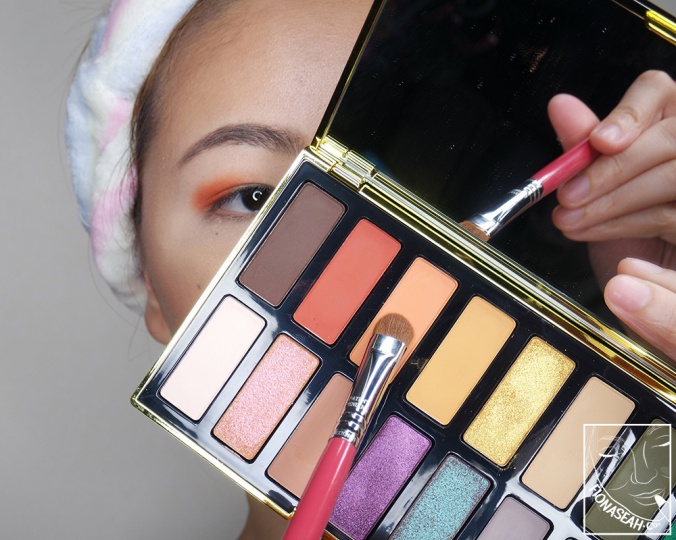
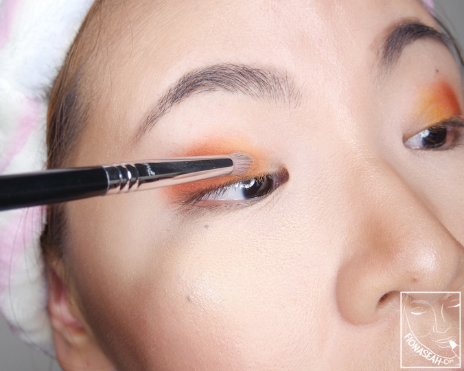
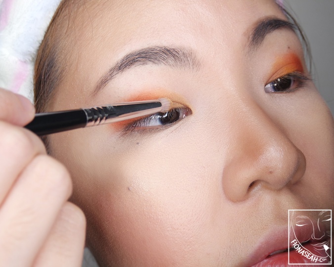
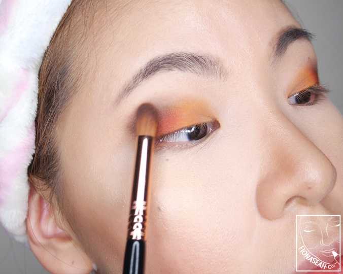
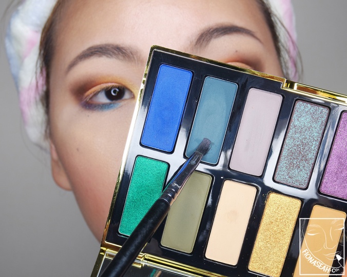
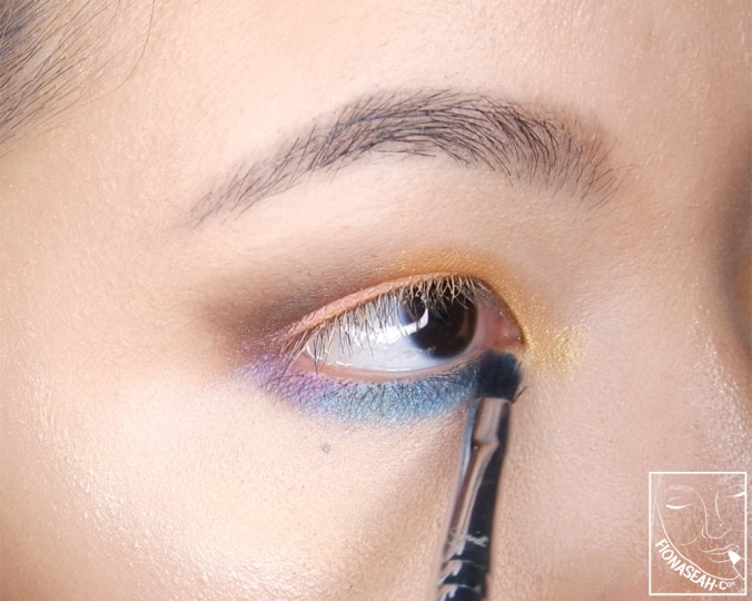
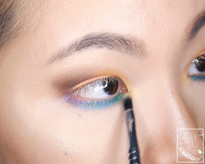
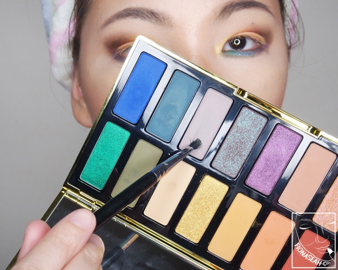
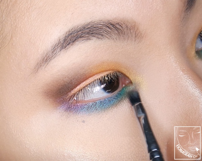
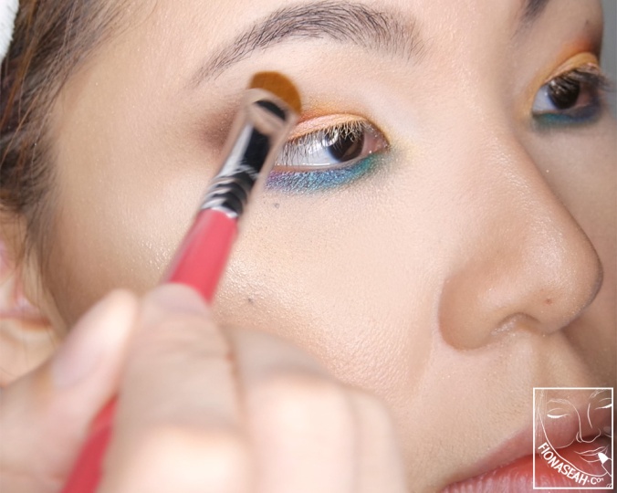
In the suggested look below, I will be attempting to apply every single shade in the palette onto my lids.
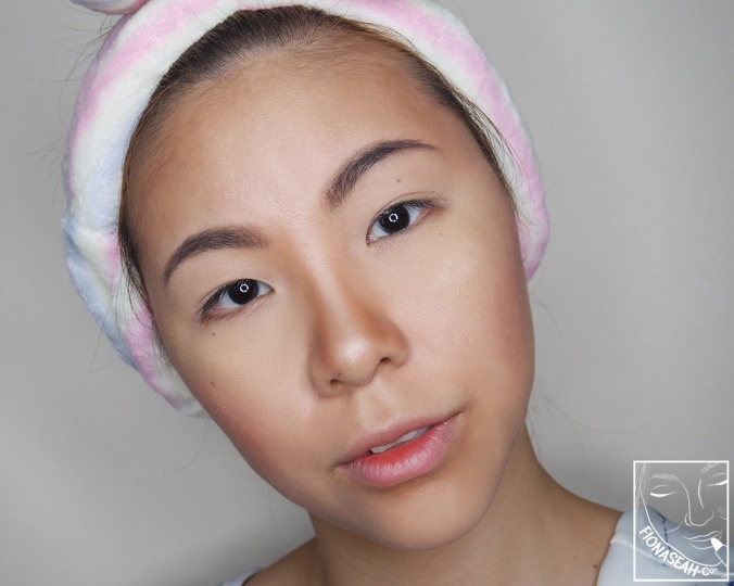
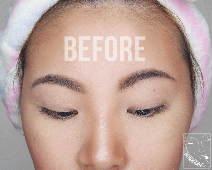
My made-up face, sans eye shadow (I know I had gone a little overboard with the bronzer here lol)
Malice
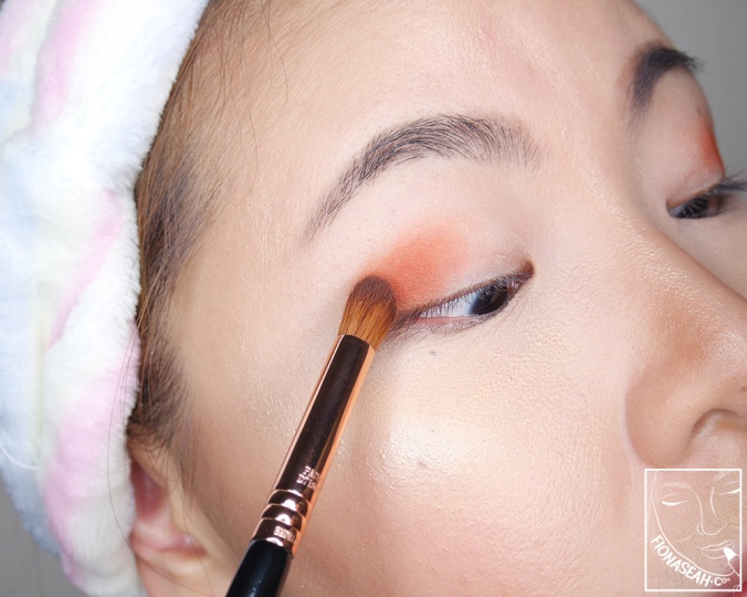
Malice
Ashley
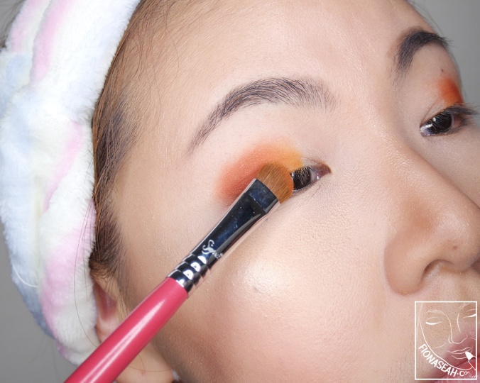
Ashley
Nancy
Nancy
Sylvia
Sylvia
Adele
Adele
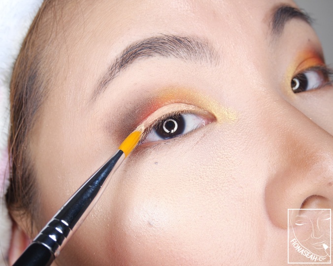
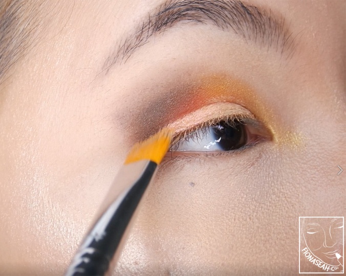
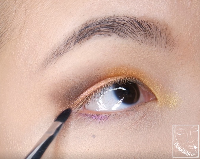
Egypt
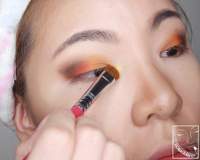
Egypt
Coating my upper lid with concealer
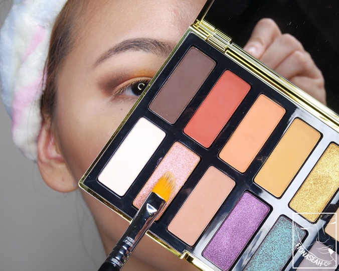
Alexandra
Alexandra (on top of the concealer)
Catherine²
Catherine²
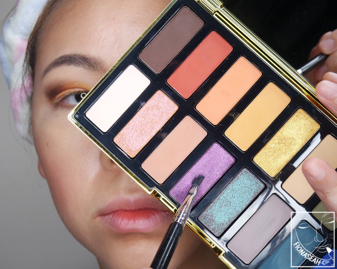
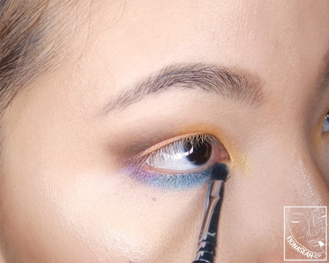
Kelly
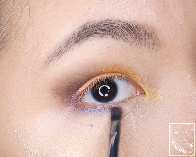
Kelly
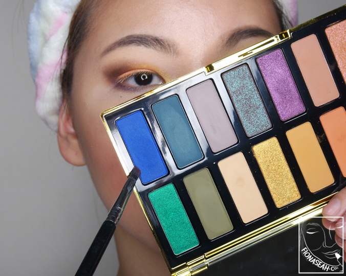
Chad
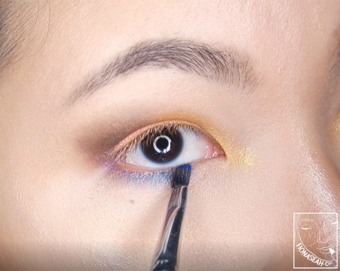
Chad
Carolyn
Carolyn
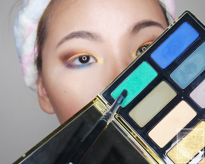
Leafar
Leafar
Lala
Lala
Sarah
Sarah
Melanie
Melanie (disappearing into my skin)
Melanie
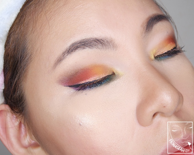
Without eye shadow → with eye shadow, eyeliner and mascara
Based on what I have gathered, it is safe to say that the warms are the stars of the palette. They deliver intense colours and are easy to blend. That said, I find the orange hues a bit repetitive. The cools, although provided additional visual interest with shades like Lala and Carolyn, have been lacklustre due to their patchy consistency and poor blendability. But in general, this palette is still relatively easier to work with as compared to those I have tried by other brands because the shades don’t need to be damp for them to show on my lids – they are already pretty pigmented on their own!
What do you think about this palette? Let me know your thoughts in the comments below or simply take a quick poll!
Thanks for reading!
Kat Von D 10th Anniversary Eyeshadow Palette is now available on Kat Von D (sold out), Sephora USA (sold out) and Sephora Singapore.
Follow me on Instagram and Facebook for bite-sized beauty updates!


Almost everyone rave a lot about this palette and now that I look your review doesn’t seem like it, right?
LikeLike
I would say as a whole, it’s an okay palette because the warms (which is the majority) perform pretty well. The cools (greens and blues) are the not-so-good ones but can still be used as a transition colours 🙂
LikeLike