Hello everyone!
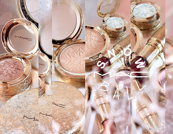
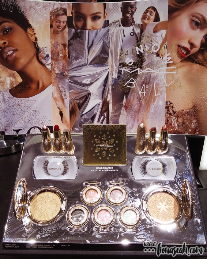
Before the Snow Ball collection took center stage with it stunning marketing visuals, there was another contender that had attracted a great deal of attention for its equally innovative packaging design.
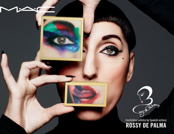
M·A·C × Rossy De Palma for Fall 2017
Born Rosa Elena García Echave in Spain, Rossy de Palma is a former fashion model, an actress and a charity spokesperson for the Ghanian Charity OrphanAid Africa which among other causes, advocates for the closure of illegal orphanages. Often dubbed a walking Picasso painting, de Palma doesn’t fit the stereotypical definition of a high-profile actress – she doesn’t have doe eyes, sharp nose nor a perfectly proportioned mouth. But it’s this extraordinary (like, literally!) look of hers that had earned her the right to walk the runways for Mugler, Gaultier, and Givenchy and become the face of luxury ad campaigns. What a role model she is!
In this day and age of nip and tuck where most people won’t even bat an eyelid to modify their appearance with cosmetic surgery (and end up looking like they were all stamped out of the same cookie cutter), her unique aesthetic comes across as striking yet authentic at the same time, like a breath of fresh air. In fact, don’t you think she looks like a Picasso-esque version of Lady Gaga?
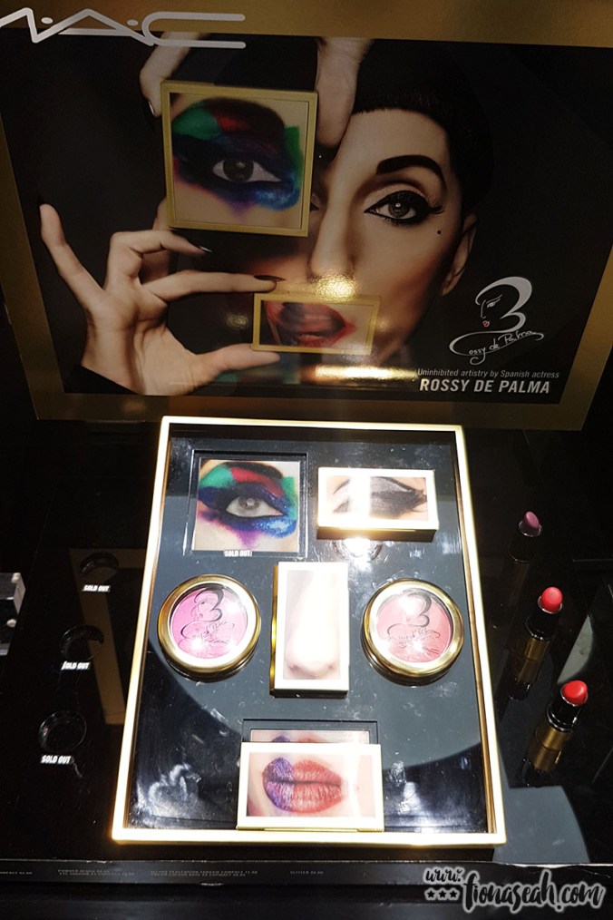
The display (FYI the one with the nose image is the contour kit – kinda like that one too)
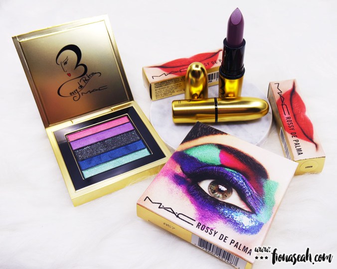
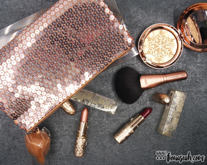
My haul!
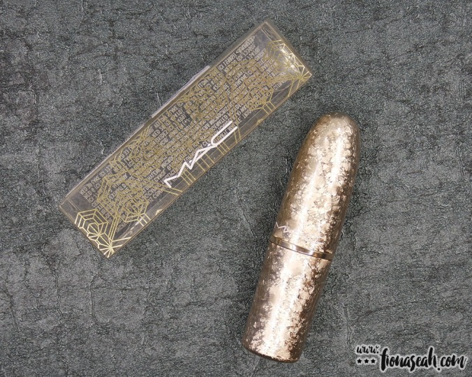
And what better way to embrace your (im)perfections than partnering with M·A·C on a collection centered around them? This collection takes inspiration from Cubism – an early-20th-century art movement created by Picasso – with gold as the primary colour and Rossy’s artistic signature plastered on all the products. For a more Cubist approach, a lenticular image of her (zoomed in, no less) unconventional facial attributes are featured on the packaging of a selected range as seen in the promotional picture above. It may not be the intention, but I like how Rossy de Palma and M·A·C are delivering a subtle screw you to bigots who have criticised her looks with this collaboration.
“Hate my fractured nose and my asymmetrical eyelids, you say? Here’s every part of me you dislike on your makeup. HA, take that!”
All jokes aside, I don’t usually venture out into buying anything else apart from lipsticks from any M·A·C collection. But the packaging is just too brilliant to resist 😆
#1 Veluxe Pearlfusion Shadow

M·A·C × Rossy De Palma Veluxe Pearlfinish Shadow (US$32 / S$72)

M·A·C × Rossy De Palma Veluxe Pearlfinish Shadow – the lenticular effect!

Other details
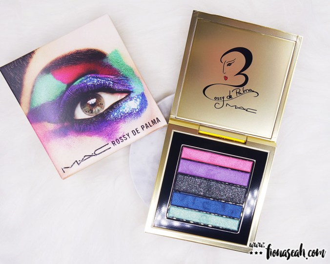
M·A·C × Rossy De Palma Veluxe Pearlfinish Shadow – the shades
SWATCHES & REVIEW

Close-up of the 6 shades, all in pans of different sizes

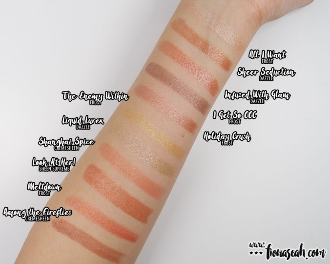
M·A·C × Rossy De Palma Veluxe Pearlfinish Shadow swatches
Pinky is described a bright pink with Veluxe Pearl finish. It is a warm-toned medium pink glistened with very fine fuchsia shimmers and is filled in the smallest pan of the palette (the same with Money) which can be a little hard for a fluffy brush to reach without touching the shade next to it.
Semi-opaque in coverage, this shade works great as a base colour. Probably due to its soft and smooth texture, it causes quite a bit of kick-up in the pan (chunks of product would come off) when picked up with a brush. Despite its flaky consistency (which is rather noticeable on the lid), it blends well on the lid without having much fallout and leaves an evenly silky finish. Also, it doesn’t have the tendency to stain like most pink eye shadows and can be easily removed.
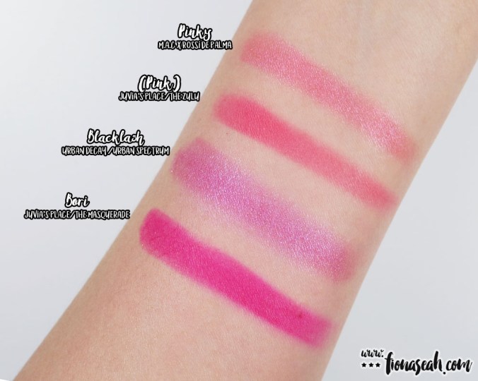
Swatch comparison for Pinky
Smokes is described as a soft lilac with Veluxe Pearl finish. It is a cool-toned purple with fine blue shimmers (albeit more subtle than the others). Powdery in texture, this shade applies unevenly on the lid with both dry and dampened brushes and has sheer colour payoff with very limited buildability. When blended out, it loses its intensity to the extent of almost fading to nothing. I had to use small patting and dabbing motions for the colour to show reasonably but it still creases and fades away the moment my lids show signs of oiliness. Therefore, I won’t recommend this to be used on its own as a single shade.

Swatch comparison for Smokes
Charcoal is described as a black with multi-colour pearl. It has a Veluxe Pearl finish mostly made of white, sparsely-scattered, in-your-face sparkles with an overall chunkier texture and powdery consistency. When hit with a brush, it leaves a negligible amount of kickback in the pan. But when applied on the lid, some product came dusting off into my eyes. Although it has fairly good pigmentation with semi-sheer (but buildable) coverage on the lid, it does not blend very well, unfortunately.
Considering that this shade would most likely be the least used of all since it is less versatile and more difficult to work with, it is pure bewilderment that it is allotted the largest pan size on this palette. Makes me wonder what the thought process behind the apportion of the pan sizes to the shades is like 🤔
Deep which is described as a dark blackened navy with Veluxe Pearl finish. This captivating shimmery cool-toned deep blue is as close as it gets to a metallic blue because of the densely packed sparkles. Deep goes on semi-opaque when first applied but can be built on to achieve full coverage. It is fairly blendable with a cream-like texture, therefore making it a joy to work with. It is definitely one of the better performers in this palette with a payoff on par with or a tad better than Pinky which wore well on me.

Swatch comparison for Charcoal and Deep
In the bottommost pan on the palette is Money, a soft green with Veluxe Pearl finish as described by M·A·C. This turquoise with fine green shimmers has a flaky texture like Pinky which tends to ball up in the pan. When applied, it gives a sheer to semi-opaque coverage (don’t be deceived by the swatch – the pigment is nothing of the sort on my lid) that would take a few coats to build the colour intensity up. A point to note, though, is that Money is rather loosely pressed as compared to the rest of the shades. Hence, although digging the brush into the pan may be necessary to get a decent payoff on the lid, it is not advisable lest you break it apart.
Nevertheless, this shade is a disappointment. Not only is it flighty on my naturally oily lid, it creases even over primer. I also had some trouble blending and diffusing this shade because it budges with the slightest contact. Even if I managed to get it work on my lid, it is only fleetingly as it started to look splotchy after two hours of wear.

Swatch comparison for Money
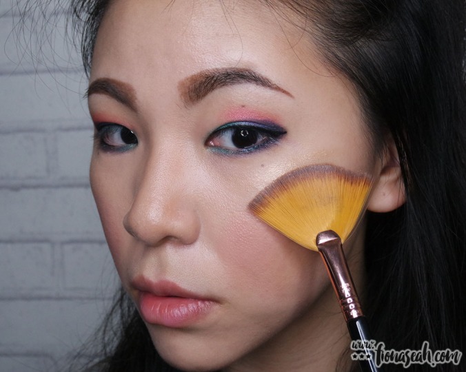
APPLICATION & SUGGESTED LOOK

The products I will be using

Using Urban Decay Eyeshadow Primer Potion to prime the lids
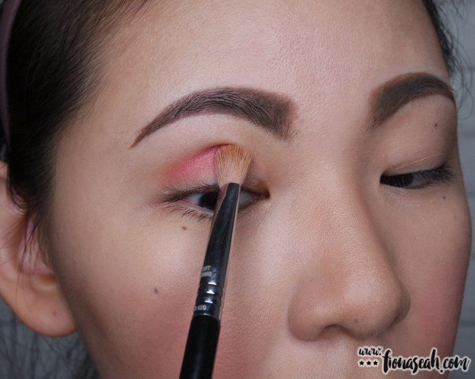
Pinky as base colour

Money to make the eyes pop

Smokes as a transition colour

Deep to add depth (no pun intended)

Smokes again to define (you can clearly see the colour rubbing off here)
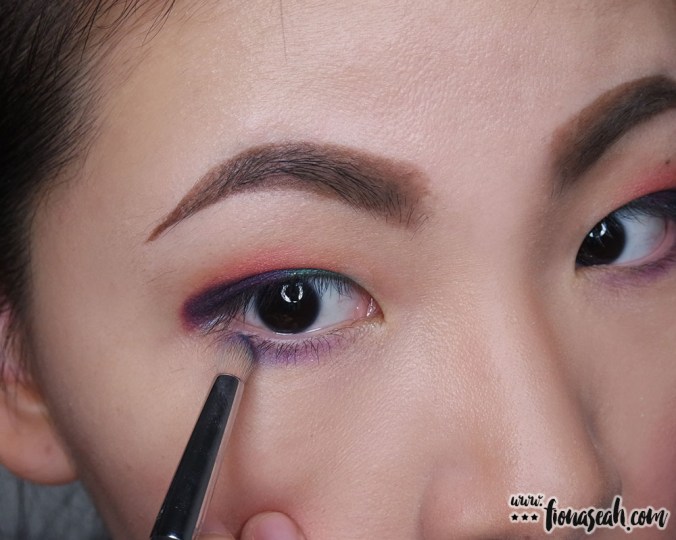
Mirroring the colours on the lower lid

Charcoal for even more depth (actually, I just wanted to wear all the shades on my lids)

Mirroring, again..

And again..

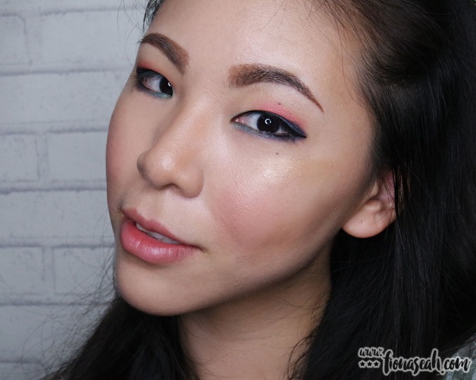
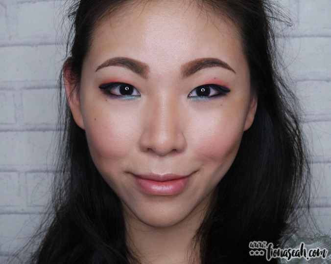
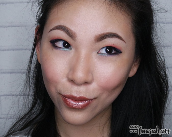
How the shades in the pan translate onto my lids

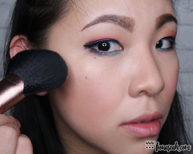
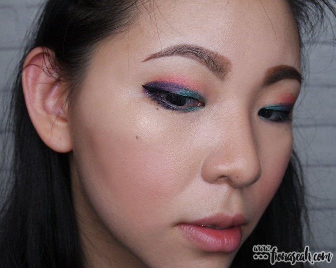
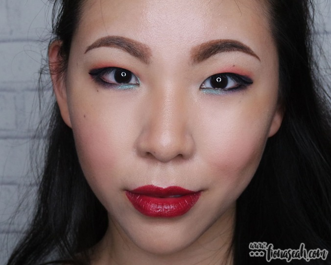
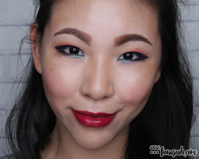
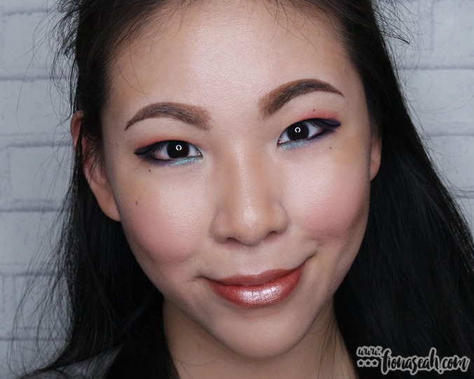
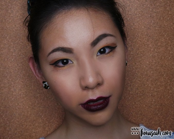
The final look!
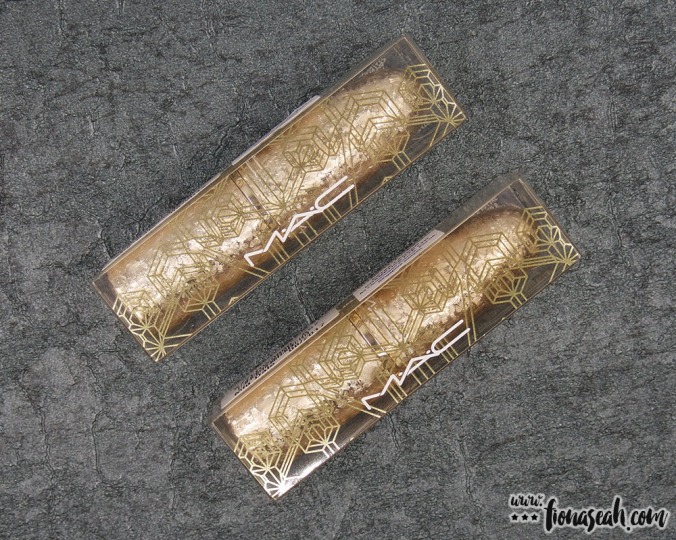
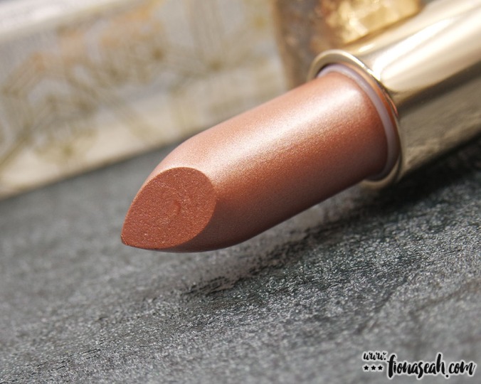
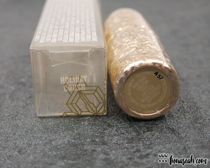
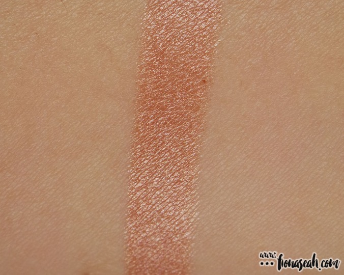
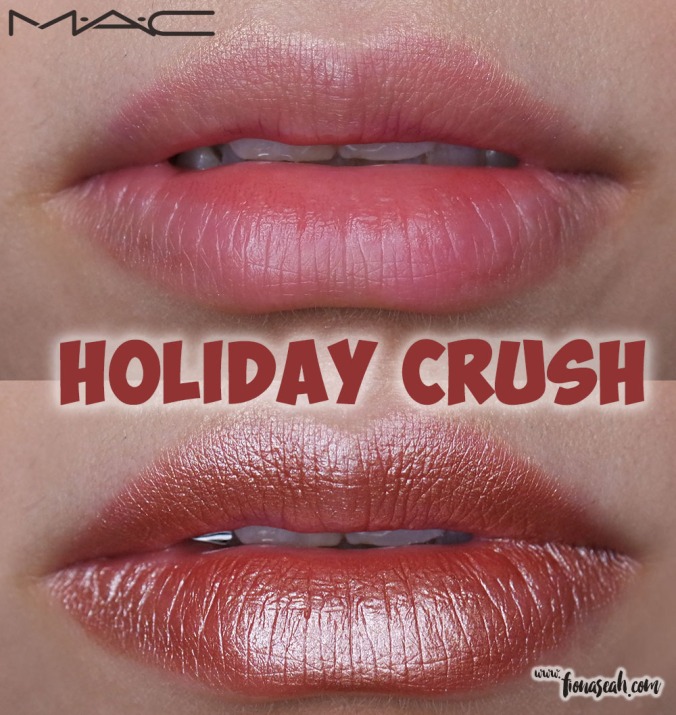
#2 Lipstick – Rossy

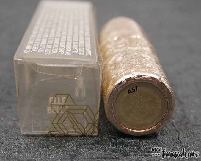
M·A·C × Rossy De Palma Lipstick packaging
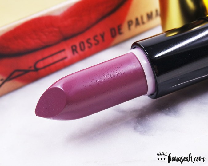
M·A·C × Rossy De Palma Lipstick in Rossy (US$17.50 / S$33)

M·A·C × Rossy De Palma Lipstick in Rossy

M·A·C × Rossy De Palma Lipstick in Rossy
M·A·C × Rossy De Palma Lipstick in Rossy

M·A·C × Rossy De Palma Lipstick in Rossy

M·A·C × Rossy De Palma Lipstick in Rossy
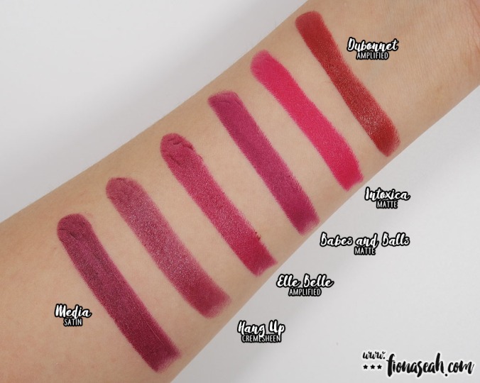
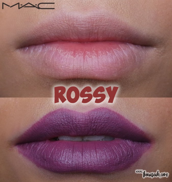
Rossy is described as a dirty mauve purple with Matte finish. Creamy in texture, this warm-toned purple glides on like butter and imparts a hint of lustre to keep the lips looking (and feeling) moisturised. The texture is slightly oily for a matte which makes it susceptible to transfer and shorter wear time. On top of that, I notice that this shade also tends to settle into my lip lines. It applies evenly and has pretty good pigmentation but requires several swipes to be reasonably opaque.
Swatch comparison for Rossy
#3 Lipstick – Phenomenal Woman

M·A·C × Rossy De Palma Lipstick in Phenomenal Woman (US$17.50 / S$33)

M·A·C × Rossy De Palma Lipstick in Phenomenal Woman
M·A·C × Rossy De Palma Lipstick in Phenomenal Woman

M·A·C × Rossy De Palma Lipstick in Phenomenal Woman

M·A·C × Rossy De Palma Lipstick in Phenomenal Woman
M·A·C × Rossy De Palma Lipstick in Phenomenal Woman
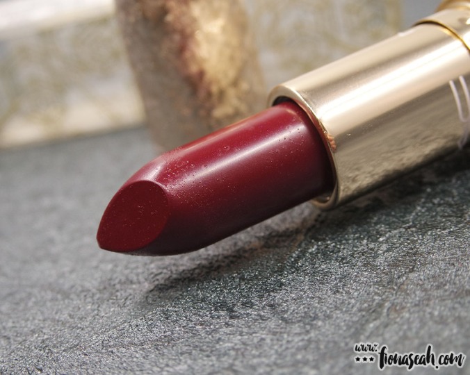
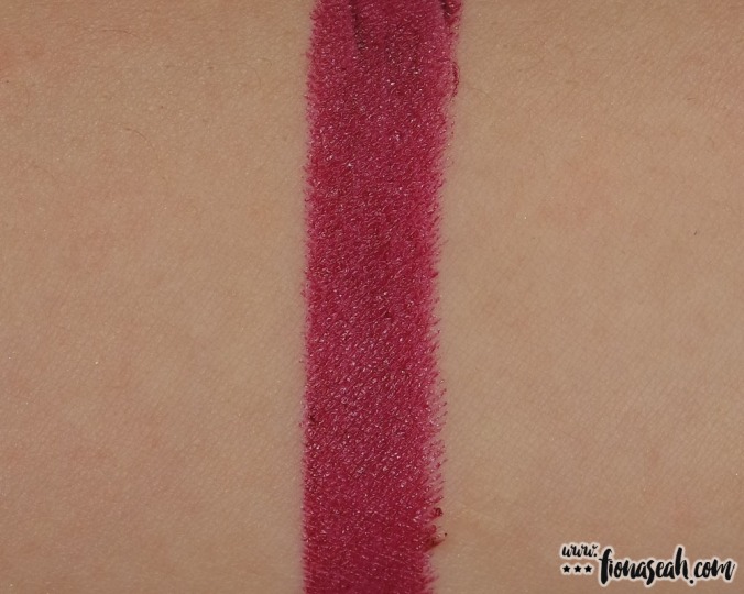
Phenomenal Woman is an online-exclusive described as a dark plum with Matte finish and is the only lipstick in this collection to sell out online. This cool-toned burgundy has a richer sheen to it which is not something I would expect from a matte formula. In fact, I think it looks more satin than matte. This shade tugs and pulls lightly at the lips during application, giving a streaky and uneven payoff which is mostly caused by the product seeping into the lip lines and clinging onto the dry patches on the lips. It has a thin and tacky texture that is neither hydrating nor drying on me.

Swatch comparison for Phenomenal Woman
I must say that I’m pleasantly surprised that, despite the fanciful packaging and unchanged pricing, the quality in the products (maybe save that few shades in the eye shadow compact that didn’t apply very well. Shame!) did not really take a beating. Has M·A·C finally come to the realisation that in the eyes of consumers, quality is king? If that’s the case, I can’t wait to see what more M·A·C has to offer for the coming year!
What do you think about M·A·C × Rossy De Palma? Let me know your comments below or take a quick poll!
Thanks for reading!
M·A·C × Rossy de Palma is now available on MACCosmetics.com and in all local M.A.C outlets.
Follow me on Instagram and Facebook for bite-sized beauty updates!