Hello everyone!
Before the internet became a household fixture, the Nintendo Entertainment System (NES) was a huge phenomenon which provided hours of enjoyment for children cooped up in the house all day (like myself). Through the NES, users were introduced to a whole new world of video games. The “Jump Man” in Donkey Kong in particular received so much attention that it was eventually made into its own game called Super Mario Bros. Today, the character is undeniably one of the things that is synonymous with the ’90s.
This year, the Italian plumber – who recently turns 32 – gets his big break in the beauty world when he was invited to collaborate on a holiday makeup collection by shu uemura. Released on 1 October in the U.S., this 25-piece Super Mario Bros-themed collection offers lipsticks, palettes, cushion cases, cleansing oil and many others presented in packaging that will hit you gamer girls right in the childhood.

Having grown up with Super Mario Bros, saying that I was excited for this launch would be an understatement. I was literally counting down the days until this collection finally makes its appearance at the local shu uemura counters on 15 November!
But sounds like Christmas came early this year as shu uemura Singapore had kindly sent me a few products to blabber about here 😍 In this first instalment of my two-part review on this collection, the spotlight will be solely on the Peach’s Eye & Cheek Palette (which has sold out in the U.S., by the way 😨).

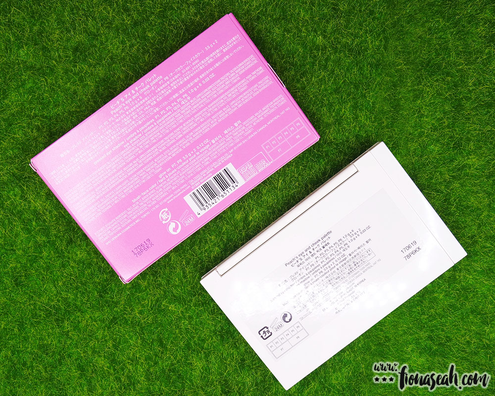
shu uemura × Super Mario Bros Peach’s Eye & Cheek Palette (S$128)

Goomba motif on the inside of the box!

shu uemura × Super Mario Bros Peach’s Eye & Cheek Palette
shu uemura × Super Mario Bros Peach’s Eye & Cheek Palette

shu uemura × Super Mario Bros Peach’s Eye & Cheek Palette
Inspired by Princess Peach (a character in the Mario franchise), the limited-edition eye and cheek palette includes a dual-ended brush, six eye shadows and two glow ons (shu uemura’s version of blush that enhances the natural glow of cheeks) embossed with some distinctive elements of the game. The shades, organised in quads of purple and brown hues, are specially curated to create two highly-achievable monochromatic looks and are exclusive to the palette.
Made with acrylic plastic with a glossy surface, the palette is pink on the outside with pixel art of some notable characters and items of Super Mario, and white on the inside. It is thin yet sturdy and doesn’t take up much storage space. Upon opening the lid, you will be greeted with a removable transparent sheet of plastic with the names (or rather purpose) of each product placed on top of the pans to guide application and perhaps, to prevent the inbuilt mirror from getting dirtied by powder residue.

From top row, left to right: IR pink, S mauve, P plum, G gold light, ME orange, ME bronze eye shadows (1.0 g x 6 / 0.03 oz) // bottom: dreamy peach, brave orange glow ons (3.5 g x 2 / 0.12 oz)
☆ Eye Shadows ☆

shu uemura × Super Mario Bros Peach’s Eye & Cheek Palette eye shadows
The base shade on the first half of the palette is described as a pink with an iridescent finish which, according to shu uemura, “offer(s) glimmering reflections of changing colors”. It is a light wash of cool pink with finely milled shimmers which have a gritty texture to it. Sheer in coverage, it acts as a lightening and smoothing agent for the shade applied atop it. It can also be used on its own for a dewy look. This feels smidgen dusty and is prone to sheer out when applied dry. Hence, you would get better results (i.e. colour intensifies and a more pronounced shine) when used with a wet brush. Otherwise, if you don’t want to leave a water stain on the eye shadow, perhaps using a dense brush would help the colour show better on the lid.

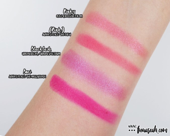
Compare Base with other similar shades from the Kat Von D Shade + Light (Plum) and Urban Decay Naked 3 palettes
The styling shade is described as a mauve with a shimmery finish. It appears more of a violet to me with warm undertones and has a slight metallic sheen to it. This shade is safely one of those eye shadows that appears dull when applied, but comes alive when light hits it. It applies sheer at first but is buildable to a semi-opaque coverage. It isn’t too soft or firm in the pan which gives it a smooth and blendable texture. The edges also diffuse rather well without losing much intensity. I experienced a negligible amount of kickback in the pan when I dabbed it with my brush but there wasn’t much fallout on me.

Compare Styling with other similar shades from the Kat Von D Shade + Light (Plum) and Urban Decay Naked 3 palettes
The defining shade is described as a plum with a pearl finish which, as defined by shu uemura, lends a “silky shimmer of light for luminous radiance”. This deep violet contains chunkier purple glitter and has a drier and somewhat uneven texture so undoubtedly there would be fallout during application. Moderately dense and generally patchy in consistency, it sheers out quickly when blended but can be built to an opaque coverage if used with a dense brush. The metallic sheen becomes rather glaring as the eye shadow is piled on. Similarly, this applies noticeably better with a dampened brush. Occasionally, I would use this shade alongside the browns to give my eyes a smokier look.

Compare Define with other similar shades from the Kat Von D Shade + Light (Plum) and Urban Decay Naked 3 palettes
APPLICATION & SUGGESTED LOOK

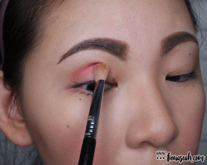
Apply the base colour all over lids with the shader side of the dual-ended brush

With the same end of the brush, apply the styling shade above the base

Define the eyes while still using the shader brush

Apply styling colour along the lower lash line with the precision end of the brush

Using the same brush, add definition along the outer corner of the eye and do a little bit of crease-cutting on the upper lid. Blend out harsh edges with shader brush.

From plain to glamourous!
The base shade on the next half of the palette is described as a gold light with glittery finish which adds “abundant sparkles for glistening glamour”. It is a cool-toned pale gold with a powdery smooth texture. The glitter in this eye shadow is more sparkly in appearance. Although it also seems more scattered, it was fortunately not messy to work with. It may offer sheer coverage but as a base colour, this packs a punch of glow even on the first layer and piling on the product will only build up the shine. I find that this shade applies more smoothly and evenly with the finger tip. On top of that, it can also be used as a lid topper to enhance the sparkle of the main eye shadow colour.

Compare Base with other similar shades from TheBalm NUDE ‘tude, Urban Decay Naked Heat and Juvia’s Place Nubian 2 palettes
The styling shade for the second look is described as an orange with a metallic finish which is supposedly “smooth like liquid with a metallic glow”. It is an orange with brown undertones and has micro-glitter distributed uniformly to give a nice, frosted sheen. This shade applies evenly and goes on semi-opaque on the first swipe when used with a finger or dense brush (dry or dampened – it doesn’t really matter). Buildable to a completely opaque coverage, it is lightweight and blends fairly well on the lid. It may feel a bit gritty in the pan but there is hardly any kickback and fallout. If I have to pick a favourite in this palette, this will be it!

Compare Styling with other similar shades from TheBalm NUDE ‘tude, Urban Decay Naked Heat and Juvia’s Place Nubian 2 palettes
Lastly, add some definition to the eye with a metallic bronze. This warm-toned brown has faint multicoloured micro-glitter that seems more loosely incorporated into the product. The eye shadow has a powdery smooth consistency with rich pigmentation. It is best applied with a dampened brush for maximum coverage and colour intensity. However, it would require a firmer hand to completely diffuse the edges.

Compare Styling with other similar shades from TheBalm NUDE ‘tude, Urban Decay Naked Heat and Juvia’s Place Nubian 2 palettes
APPLICATION & SUGGESTED LOOK

Apply base colour all over the lid with the shader brush

Using the same brush, pack on some colours with the styling shade

Define the eye by adding a darker shade on the outer corner

Cut them crease with the darkest shade on the palette!

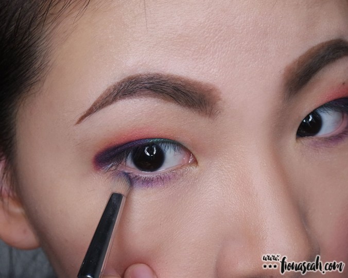
Be extra – apply defining shade on the inner corner to add emphasis to the center of the lid

Line the lower lash line with the styling shade

Followed by the defining shade on the outer corner

Don’t forget to blend out the edges!

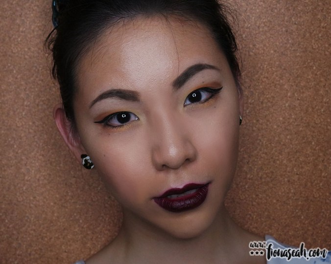
From girl-next-door to femme fatale 🤗

When glam meets edgy
☆ Glow Ons ☆

shu uemura × Super Mario Bros Peach’s Eye & Cheek Palette blush
Dreamy Peach is a warm pink with flecks of gold shimmers even though it appears to have more orange undertones in the pan. This Super Star and Super Mushroom-embossed blush has sheer pigmentation and can be built to a semi-sheer at most. It blends quite easily owing to its soft texture but has the tendency to sheer out on normal or drier skin (I had swatch it on my wrist a couple of times and it fades away quickly every time). It doesn’t cause any kickback in the pan nor leave any noticeable dents even after multiple uses and that is great if you, like me, don’t want to ruin the cute embossing on the glow ons 😁

Darling Princess (3-4 swipes)

Darling Princess Darling Princess (3-4 swipes, blended out)
Brave Orange is a pale neon orange with yellow undertones topped with accents of gold shimmers. It comes with Fire Flower and the iconic Question Mark Block embossed on it. Soft and lightly powdery in texture, this blush feels luxuriously smooth to the touch and is buildable to a semi-sheer coverage. I actually find this more pigmented than Dreamy Peach and surprisingly, does not camouflage into my Chinese skin tone nor look too yellowish on me. It can be doubled as a bronzer for lighter skin tones to give a subtle contour. However, it does have the tendency to cling onto the drier areas of the skin which could be why it applied slightly uneven on me and needed some effort to buff out the unsightly streak.

Adventure Princess (1 swipe)

Adventure Princess (3-4 swipes)

Adventure Princess for contouring (using Sigma F04 Extreme Structure Contour™ Brush)

Adventure Princess for contouring (using Sigma F04 Extreme Structure Contour™ Brush)

Two looks (without the lipstick, yet!) side by side. Which one do you prefer?
As a Japanese brand serving international markets, shu uemura has managed to strike a balance between bold and delicate with this palette to cater to people on either ends of the preference spectrum. While it delivers a relatively lighter wash of colour with a touch of glitter when used as-is, these attributes can also be easily amped up on the lid with your finger tip or a dampened brush. That said, the choice of shades (especially the glow ons) seems to gear towards lighter skin tones in general.
And in case you didn’t catch the price earlier, this would set you back a whooping S$128 so unless you are obsessed with Super Mario or don’t mind splurging a few hundred dollars on a high-end product (made with top grade ingredients and presumably state-of-the-art technology, no less), I honestly don’t think this is worth burning a hole in your pocket for in terms of the price per ounce for each product in this palette.
What are your thoughts on this adorable palette? Let me know what you think in the comments below or take a quick poll!
Totally unrelated to this palette but what are some of your favourite NES games? Apart from Super Mario Bros, I was hooked on playing Antarctic Adventure, Ice Climber, Circus, Duck Hunt, Bubble Bobble, Popeye and Bomberman 😆 There should be more but I can’t remember their names at the moment. Just listening to the 8-bit music of these games brings back so many childhood memories!
Anyhoo, thanks for reading and stay tuned for part two of this collection 🙂
shu uemura × Super Mario Bros is now available on the Sephora Singapore (online), at TANGS and shu uemura boutiques islandwide.
The product featured in this review was editorially selected. All opinions, as always, are genuine and uninfluenced.
Follow me on Instagram and Facebook for bite-sized beauty updates!