Hello everyone!
The best-selling Sigma palette is back by popular demand – and this time, with an improved packaging. First launched in September 2013, the rebooted Creme de Couture Pressed Color Palette includes all original 16 vibrant macaron-inspired pigments in a “smooth, blendable formula”. Each of these Sigma-exclusive shades has a matte finish with extreme, long-lasting color payoff and can be used all-over the face (as some shades are not recommended to be used as eye shadows).
This palette debuted at US$32 but is now retailing for US$39. Considering that the cost of raw materials could have increased substantially over the past four years, the slight price hike is understandable. Nevertheless, you can shave a few bucks off the current retail price (10% discount, to be exact) if you checkout with my code “FIONASEAH“. Sigma ships all orders within the U.S. at a flat rate of US$4.95 while free shipping is offered to U.S. and international orders above US$50 and US$150 respectively.

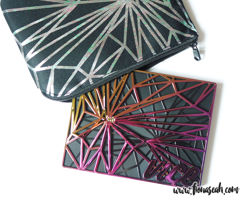
Sigma Beauty Creme de Couture Pressed Color Palette (box)

Sigma Beauty Creme de Couture Pressed Color Palette (back)

Sigma Beauty Creme de Couture Pressed Color Palette

Sigma Beauty Creme de Couture Pressed Color Palette
The palette retains its squarish shape but certainly has a more upscale appearance than the packaging before due to the water marble design and glossy plastic gold lettering (neat, sans-serif typeface unlike the tacky, cursive one before) on the cover that feels velvety-matte to the touch. Furthermore, the lid now has a magnetic closure as opposed to having to remove the lid entirely previously. This palette comes with a mirror (none before) and a thin protective plastic sheet above the pans and has a shelf life of 24 months.
I am usually put off by bright eye shadows, but there’s just something about this palette that made me want to lay my hands on it. It could be the way the shades are systematically arranged. Analogous colours are placed next to one another in this palette which makes it a dreamscape for the OCD in me.

But wait, what is that blue doing at the bottom row?
The names of the shades are the same as before, and you can easily tell how they are derived unlike those of most eye shadow palettes in the market which felt like they were picked using a lottery spinner.

Swatches, three to four swipes for every shade (applied with Sigma E55 Eye Shading Brush and M·A·C Prep + Prime Fix+. Brush is cleaned with semi-damp makeup wipe and dried with tissue paper each time)
For a more structured review, the shades will be segregated into colour schemes and swatches will be done using my index finger to show the full potential of the colour intensity. Then, I will compare them to similar colours from other palettes (Urban Decay × Jean Michel Basquiat Tenant Palette, LORAC I ❤ Brunch PRO Palette, Juvia’s Place The Zulu and Masquerade Palettes) in my stash.
PINKS

The pinks of Sigma Creme de Couture Pressed Shadow Palette
Redberry Rose is described as a brilliant, true hot pink. It is a cool-toned fuchsia with a matte finish. It has an intense pigmentation in a single layer with a buildable opacity to provide a full coverage. Non-powdery, it has a soft and blendable texture which makes it easy to work with. This shade is determined to be unsafe for eye area since it has the tendency to stain (even with primer) but I had worn it for a couple of hours without any detrimental effect to my sensitive eye. That said, do use this with caution.
Apricot Flower is described as a perfectly-warm, mod peach. It is a light coral with warm undertones and a matte finish. It applies fairly well and has a semi-opaque pigmentation which ultimately becomes a hue deeper when piled on. However, I won’t recommend adding too many layers as I ended up having difficulty diffusing and blending out the edges.
Passion Fruit is described as a crisp, neutral pink. It is a medium coral-brown with cool undertones and a matte finish. It applies and blends well, giving a nearly-opaque pigmentation without having to apply much pressure to the lid. The texture was, however, slightly loose so there was considerable amount of kickback in the pan. There was also a bit of a fallout during application.
Cherry Blossom is described as a cool, bold pastel pink. It is a washed-out pink with cool undertones and a matte finish. Soft in texture, this shade applies smoothly and evenly on the lids while offering sheer coverage. It is hardly pigmented (enabling it to be removed very easily) and does not seem to build up even though it blends relatively well. This shade works best as a base colour or to tone down any heavy-handedness that may occur.
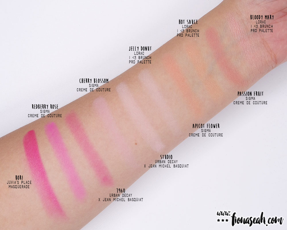
Swatch comparison for the pinks on the Sigma Creme de Couture Palette
WARMS

The warms of Sigma Creme de Couture Pressed Shadow Palette
Meyer Lemon is described as a zesty, buttery yellow. It is a washed-out pastel yellow with cool undertones and a matte finish. It has a rather soft but chalky and powdery texture, so fallout is inevitable during application. In addition, the first layer lends a patchy consistency and the colour somehow fades even more as I try to blend it out. I eventually found myself dipping my brush into the pan more often than I had expected just to achieve a reasonably even and opaque payoff.
Ginger Pumpkin is described as a muted-orange spice. It is a neon orange with warm undertones and a matte finish. Although thicker and slightly powdery in texture, this shade applies smooth and soft without creasing and blended fairly well. It has great colour payoff and is vibrantly pigmented with an opaque coverage in a single layer, which also causes it to stain (and therefore deeming it unsafe for the eye area).
Café au Lait is described as a classic, warm coffee brown. It is a medium brown with warm undertones and a creamy matte finish. It has a moderately powdery texture with a soft and smooth consistency. This shade is able to give an even and opaque colour payoff on the first application using either dry or damp brushes. The excess powder adheres to the lid during application and therefore, did not cause much fallout problems. The edges blend pretty well, too.
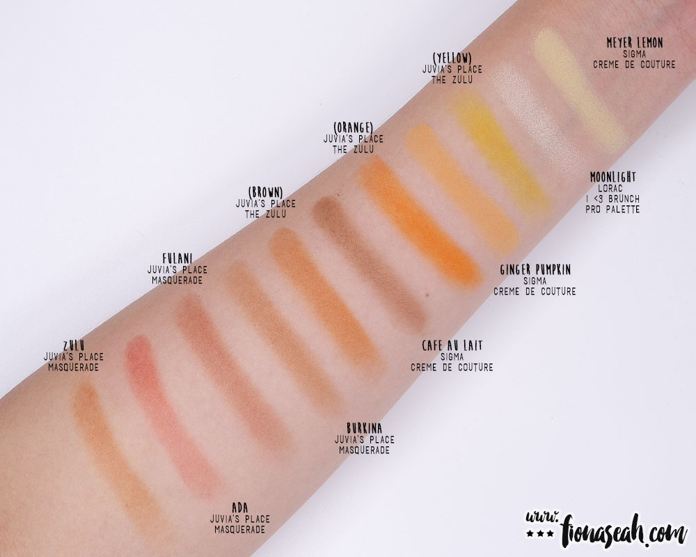
Swatch comparison for the warms on the Sigma Creme de Couture Palette

Kickbacks occurring mostly in Apricot Flower and Passion Fruit
PURPLES

The purples of Sigma Creme de Couture Pressed Shadow Palette
Violet Whip is described as a milky, cool lavender. It is a pale, washed-out lilac with a matte finish. Soft and smooth to the touch, it has a slightly chalky and uneven texture on the first application which can simply be straightened out with a wee bit more product layered on top. Easily blendable on the lids, this shade is also ideal for ombré eye makeup looks.
Lavender Honey is described as a pink-violet pop. It is a muted warm-toned purple with a matte finish. It has a rich, semi-opaque colour payoff which can easily be built up to full coverage. It applies moderately well with no fallout during application. Due to its overall drier texture, there would be some difficulties in blending out the edges. As with most purple or pink pigments, Lavender Honey stains and is therefore unsuitable to use as an eye shadow (even though it posed minimal to no issues to me).
Cassis is described as a striking, royal purple. It is a cool-toned purple with a matte finish and an intense colour payoff. This shade applies smooth but somewhat uneven, resulting to a slightly chalky texture that did not blend very well on the lid. And when it does to a little extent, the eye shadow loses its intensity. It is almost impossible to diffuse it without turning it into a patchy fuchsia. Likewise, this can and will stain – it took me a couple of separate washes to remove this entirely from my lid!
Elderberry is accurately described as a deep, smokey purple with a matte finish. Contrary to what is seen in the pan, this shade goes on sheer in one layer. Furthermore, despite its smooth texture, it applies noticeably unevenly and patchy. To get somewhat of a decent pigmentation and coverage, you would need to go back and forth between digging your brush into the pan (there won’t be much kickback, thankfully) and filling the lids with this not-so-blendable eye shadow.

Swatch comparison for the purples on the Sigma Creme de Couture Palette
BLUES

The blues of Sigma Creme de Couture Pressed Shadow Palette
Blueberry Cream is described as a nearly-neon, pastel sky blue. It is a muted blue with warm undertones and a matte finish. Smooth in application, this shade blends fairly well on the lids and leaves no fallout behind. Although the payoff is uneven and sheer in a single layer, it is buildable to a semi-opaque and medium intensity.
Blue Chocolat is described as a pale, calming aqua. It is a pale blue with cool undertones and a matte finish. It has a smooth consistency and a mostly sheer but buildable coverage. The edges also blend moderately well on the lids with no fallout during application.
To the untrained eye, these two blue shades may look identical (perhaps that’s why the pans are placed away from each other on the palette to avoid giving the impression of being repetitive) but if you look closely, Blue Chocolat not only appears to be more pigmented, but it also has a stronger white base to it than Blueberry Cream. Having said that, I still don’t reckon the contrast to be great enough to warrant the inclusion of two similar-looking blues in the palette (they do look the same from afar). As a matter of fact, I feel that it should be replaced with a darker shade of blue for the relaunch of the palette.
GREENS

The greens of Sigma Creme de Couture Pressed Shadow Palette
Almond Pear is described as a captivating, sea green. It is a pale cool-toned cyan with a creamy matte finish. It has a buttery smooth texture and an excellent colour payoff with semi-opaque to full coverage. Highly blendable, it is easy to work on the lids as it doesn’t require much effort to soften any harsh edges. However, it tends to lose its vibrancy (i.e. becomes a lot more muted) as I try to blend it out.
Crème de Menthe is described as a slightly-grey, blue green. It is a muted warm-toned teal with a matte finish. It can be a little messy to use owing to its chalky and slightly powdery texture. But its great pigmentation and near-opaque consistency make up for these shortcomings. Similarly, this shade loses its intensity when blended out.
Citron Pistachio is described as a vivid, citrus green. It is a muted lime green with a velvety soft matte finish. It has a thicker texture coupled with a vibrantly pigmented payoff. The edges blend moderately well without the colour fading much and turning patchy in the process.

Swatch comparison for the blues and greens on the Sigma Creme de Couture Palette
Having tried the palette myself, I am fully convinced that there are practically no limit to the amount of unique looks you can come up with with it and I have some examples to prove this. As an afterthought, I thought it would also be uber-fun to state what local food these looks might have taken inspiration from to tie in with the theme of this palette 😆 The eye shadows were applied atop a layer of Urban Decay Eye Shadow Primer Potion on my lids with the following brushes: Sigma E60 Large Shader, Sigma E25 Blending, Sigma E30 Pencil and Sephora Multitasker Shadow #63.
LOOK 1: PADDLE POP

Look #1

Look #1
*cues Paddle Pop theme song*
As a tribute to the ice-cream that made our childhood, I painted my lids paddle pop-coloured rainbow using at least one shade from every colour scheme (apart from the warms which I had inadvertently forgotten about): Passion Fruit, Redberry Rose, Lavender Honey, Elderberry, Blue Chocolat, Almond Pear and Citron Pistachio.
LOOK 2: KATONG LAKSA

Look #2

Look #2
What local delicacy comes to mind when you think of yellow and orange hues? For me, it has got to be our highly acclaimed laksa. This look recreates the unmistakable bold orange colour of the popular spicy noodle soup found in Singapore and other parts of Southeast Asia (well, it can also take after the colours of Indian curry because we preach racial harmony and embrace diversity, y’all) using mainly the warms: Meyer Lemon, Ginger Pumpkin and Cafe Au Lait. Admittedly, this look seems half-finished without the reds (since there isn’t any reds in the palette), like how a bowl of laksa isn’t complete without the chili paste.
LOOK 3: PURPLE AGAR-AGAR

Look #3

Look #3

Look #3
Inspired by my favourite local jelly-like dessert (the middle one, obviously), this look was created using mainly the purples, as well as a hint of blue and green, in the palette namely: Violet Whip, Lavender Honey, Cassis, Elderberry, Blue Chocolat and Almond Pear. With hindsight, I could also use the greens to recreate the colours of honeydew-flavoured Agar-Agar on my lids 😆

All in all, this is a rather fun palette with a good range of decently pigmented pastel colours at a pretty affordable price though it isn’t practical for everyday use. The eye shadows are neither firm nor stiff in the pan so it was easy for the brush to pick up the product. My only gripe, however, was the the size of the pan – they’re a tad too small for my liking (and my shader brush).
At first glance, the pastel colours may seem intimidating in the pan, but they are actually more forgiving than dark neutrals, which more often than not lead to a smokey mess. As long as you know your colour wheel (or if all else fails, simply go with monochromatic looks like how I did above) and know a thing or two about blending, you can hardly go wrong with pastels. So if you’re game enough to experiment with unconventional shades, don’t hesitate to get this palette!
And yes, for the record, this palette was paid with my own money 😁
What are your thoughts about the Creme de Couture palette? Let me know your thoughts in the comments below or take a quick poll!
Thanks for reading!
The Sigma Beauty Creme de Couture Pressed Color Palette is now available on SigmaBeauty.com. Use code “FIONASEAH” for 10% off all Sigma Beauty orders!
Follow me on Instagram and Facebook for bite-sized beauty updates!