Hello there.. I’ve been on hiatus for far too long 😝 *inserts work rambles*
But fret not, the wallet remained hard at work to feed my makeup addiction and keep the stash updated with the latest products. Scores of beauty collections might have come and gone during my absence from the blogosphere, but that doesn’t mean I am not allowed to talk about them! Plus, according to a recent poll I did on my Instagram, many of you don’t seem to mind reviews on past collections, so here goes 😁
Last September, The Walt Disney Company and ColourPop teamed up on limited-edition fairy tale-themed collection featuring some of the original Disney princesses in their Premiere Series forms (don’t know about you but I’m just not diggin’ this style 🤷♀️) gracing the packaging of their respective kits. The line-up consists of a 15-pan eye shadow palette (It’s a Princess Thing – seriously meh choice of shades), six Crème Lux Lipsticks (Belle / Ariel / Snow White / Tiana / Jasmine / Cinderella – each designed to match the skin tone of the featured princess), three Ultra Glossy Lips (Bibbidi / Boo / Bobbidi), six Super Shock Shadows and two Super Shock Highlighters (each with name inspired by the soundtrack of the movie in which the princess was starred).
ColourPop x Disney Designer (those scribbles on the tubes are actually the princesses’ autograph!)
ColourPop x Disney Designer
ColourPop x Disney Designer
ColourPop x Disney Designer
Due to popular demand, this collection was restocked several times and I only managed to get the lipsticks during its second run because procrastination happened 🙊
ColourPop Crème Lux Lipstick in Ariel (I’ve moved to a place that doesn’t allow me to have a workroom, so hopefully this explains the background 🤣)
ColourPop Crème Lux Lipstick in Ariel
Ariel is described as a peachy beige nude with a Crème finish. Unlike the swatches provided by ColourPop, this has more coral undertones than depicted (i.e. more orange than dusty rose) so I did not find it very flattering on my yellow skin tone. Otherwise, this hydrating, highly pigmented MLBB shade is perfect for daily wear – even without a full face of makeup – as it blends nicely into the lips while still intensifying the natural lip colour so as to draw attention to the lips. The formula, as with other Crème Lux Lipsticks, has a buttery smooth texture and has a nice slip when applied. However, it tends to bleed a little, and reapplication is definitely needed after a few hours of wear as it is not transfer-proof.
ColourPop Crème Lux Lipstick in Ariel (swatch comparison)
Belle is described as a rosy berry with a Crème finish. Despite the darker hue, this medium reddish mauve with brown undertones is extremely wearable in actual life and would look absolutely flattering on any skin tone. It is vibrant enough to make a subtle statement but when paired with bold looks, it totally screams rocker chic. Belle delivers full-coverage pigment with a creamy consistency and is lightly matte in appearance. It is slightly more long-lasting so it tends to be more drying (still bearable nonetheless) than the other shades.
Tiana is described as a deep oxblood red with a Crème finish. Silky smooth in application and soft and lightweight (akin to a lip balm!) in texture, this cool reddish purple (more red undertone than purple in my opinion) gives an amazing colour pay-off (the colour matches that of the bullet too!) that does not bleed into the fine lines. Tiana isn’t very dark from a neutral perspective and certainly complements any skin tone, but I must say it would look best on medium to dark ones. has an impressive staying power which is such a rarity for matte-ish deep berry shades like this (M.A.C, are you taking notes?). But once it does wear off (I’m talking about at least 6 hours of wear), it fades to an even pretty tint. I can’t recommend this beauty enough!
ColourPop Crème Lux Lipstick in Belle & Tiana (swatch comparison)
Despite the affordable prices, ColourPop has never been one to disappoint when it comes to quality, and I am glad that even after four years in the business and getting all that recognition, this hasn’t changed a bit. And this collection is just another example to add to the list. Psst.. I can’t wait to try their expanded line of eye products!
What do you think about this collaboration? Let me know your views in the comments below, or take a quick poll!
Thanks for reading!
ColourPop × Disney Designer is now available on ColourPop.com.
With nearly every makeup product imaginable already being sold on the market, brands are at risk of losing their footing if they don’t innovate. From packaging revamp to striking up a collaboration with high-profile figures, companies such as M·A·C have been employing numerous marketing strategies to shake the somewhat stagnant beauty industry to great success, and it sure didn’t take long for emerging brands like ColourPop to learn the tricks of the trade and follow their footsteps.
Being a (largely) e-commerce brand, the decision to book social media influencers to front their beauty campaigns is a no-brainer for ColourPop. But what makes them more relatable than any other brands (apart from their low costs) is how they have been promoting a sense of inclusivity by putting the spotlight on people of colour – Latinas (Kathleen Lights, ILuvSarahii), Asians (Jenn Im, Hello Kitty 😂) and now the third African-American after Ellarie and Karrueche, MakeupShayla.
For the unfamiliar, MakeUpShayla (whose real name is Shayla Mitchell) is a beauty guru with nearly 600,000 subscribers on YouTube and over 2 million followers on Instagram. As part of her larger goal to make brands more diverse, she jumped at the chance to collaborate with ColourPop to come up with makeup that would complement darker skin tones.
Her collection, which comprises Crème Lux Lipsticks(OOUUUU! / Quickie / C’mon Sis), Luster Dust Loose Highlighter(Boomin’ / Pose), Ultra Glossy Lip(Neat Freak) and a Pressed Powder Shadow Palette(Perception), is a throwback to the emo era with paint splatters (albeit emblazoned in gold foil) all over the black packaging. You could buy the entire collection in a bundle for five bucks less, or simply get the eye shadow palette and another seven-dollar item to enjoy free domestic shipping. Since I’m not residing in the U.S., I would have to fill my shopping basket with more products to have them shipped to me at no cost. So lucky you – more of ColourPop in this review!
With 16 bold yet versatile shades for creating day-to-night looks, Perception is a refreshing change from the neutral and rose gold palettes that have been sprouting up everywhere like mushrooms. At just US$23, you are essentially paying about US$1.50 per gram of eye shadow (for comparison, M·A·C charges about U$4 per gram).
Despite the low price, it still comes with a mirror (covered by a protective film)! Having a mirror in your eye shadow palette is like realising your dress has pockets – they are little bonuses that you never know when will come in handy, so that certainly contributed to the positive first impression. Besides, a lot of attention was paid to the overall aesthetics of the palette as can be seen from the gold-scripted names underneath each pan. For the record, printing the names of eye shadows isn’t a common practice of ColourPop!
The following palettes were selected for comparison purposes due to their similarities to Perception: Kat Von D 10th Anniversary · Kat Von D Saint and Sinner
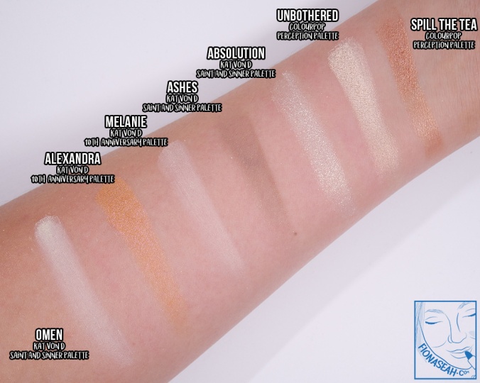
Unbothered is described as a metallic ivory with a peachy flip. This cream contains ivory gold micro-shimmer that lends a radiant (yet not too obtrusive) shine to the eyes. It has a smooth and silky application (almost like Satin finish) and is finely milled to provide deeper coverage. The texture adheres to the lid very well without appearing streaky and blended out very easily even in wet state. For comparison swatches, please scroll down to the review on Spill The Tea.
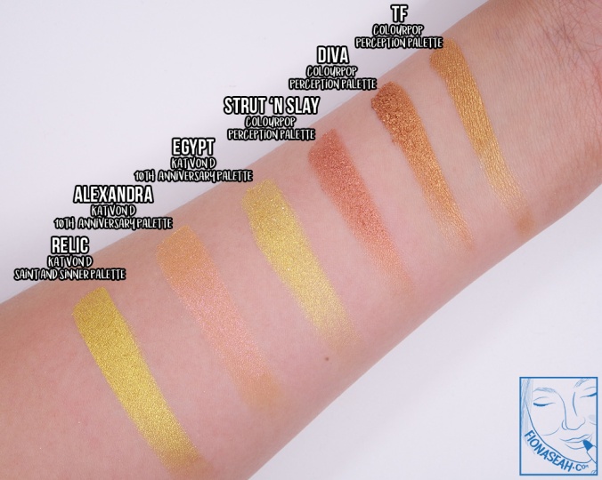
TF is described as a metallic true gold. Upon application, this eye shadow luxuriously envelops the lids like the finest silk (because the texture is so smooth!) with a high-shine gold shimmer-infused (somewhat muted) warm gold colour. When used dry, it goes on slightly sheer on first pass but is buildable to full opacity but the payoff becomes richer and more intense once it comes in contact with water. There was no fallout and edges were relatively easy to diffuse. For comparison swatches, please scroll down to the review on Strut ‘n Slay.
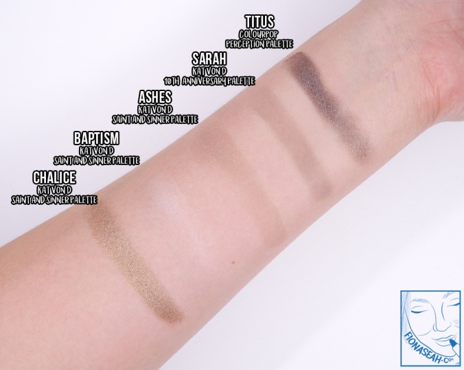
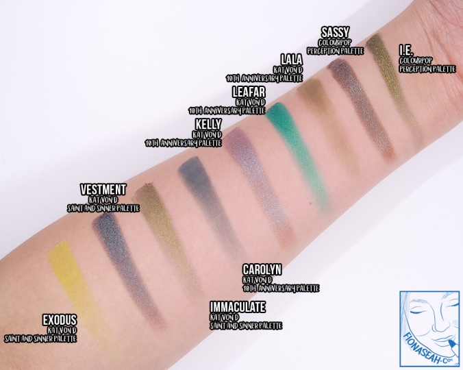
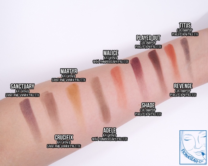
Titus is described as a metallic gunmetal. To be more explicit, it is a grey with purple undertones which has small yet sparse predominantly silver shimmer particles. It has semi-sheer payoff which improves slightly when used with a dampened brush. Although the texture was smooth (as with majority of the shades in this palette), it took me a bit of effort to diffuse the edges and after awhile, it became patchy on my lid. On top of that, I noticed that it started to settle into my crease about two hours into wear.
Swatch comparison for Titus
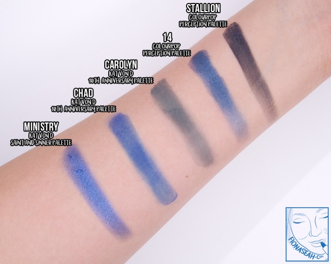
Stallion is described as a matte black with blue glitter. Like Titus, this bluish-black contains shimmer that scatters all over the skin when applied. But in terms of application, this performs much worse due to its slightly grainier texture which refuses to adhere to my lid, thereby causing some fallout issues. Although pigmented, it tends to become patchy once it is blended out (which is also a difficult task). Generally, I find this shade to be rather messy – there was never a time when the area around the pan would be spotless after use because of the kickback. For comparison swatches, please scroll down to the review on 14.
Spill the Tea is described as a metallic warm taupe. This warm rose gold has a finish more metallic than the ones mentioned before this because of its densely packed shimmer. It has a smooth but uneven consistency which doesn’t blend out very well. A lot of the product tend to congregate at one spot, leaving the other areas sheer. But I realised the application got better when used with a dampened brush.
Swatch comparison for Spill the Tea and Unbothered
Diva is described as a metallic amber. This finely milled deep copper is densely packed with shimmer of the same colour, rendering it a true metallic effect. It is a darker, warmer and certainly a more pigmented version of TF. Loosely pressed and moderately creamy in texture, a lot of product comes off the pan easily in a powdery soft form with just a small dab of the brush. As kickback is expected for this shade, it would be advisable to pick up the pigment with a light hand. When applied, it yields a smooth and intense pigmentation even in its wet state (which makes it suitable to be used as a liner too) without fallout. Diva is certainly one of the better performers in the palette. For comparison swatches, please scroll down to the review on Strut ‘n Slay.
I.E. is described as a metallic olive. This muted army green is flaked with gold micro-shimmer and it applies pigmented on the lid with minimal fallout when patted on top of a primer. However, it quickly loses its intensity upon being blended out, becoming a patch of muddy grey with an uneven texture. I found the colour payoff and consistency to be much better when applied with a dampened brush. For comparison swatches, please scroll down to the review on Sassy.
14 is described as a metallic navy with closely packed blue shimmer that provides a uniform shine with every application. Fairly smooth in texture, it has an even consistency and a nearly opaque pigmentation. But it was a bit challenging for me to blend out the harsh edges without causing them to become blotchy in the process. I prefer applying this wet to maximise its intensity.
Swatch comparison for Stallion and 14
Strut ‘n Slay is described as a metallic rosy copper with a name inspired by Shayla’s signature tagline. The colour payoff is mostly opaque in a single layer, and despite it being of a shimmery finish, this shade does not catch as much light as the other metallic ones in this palette. Furthermore, the product did not seem to adhere very well to my skin as there was a reasonable amount of fallout during application. However, it blends out seamlessly without losing much intensity.
Swatch comparison for TF, Diva and Strut ‘n Slay
Culture is described as a matte soft brown. Moderately pigmented, this muted orangey brown has a sheer-to-medium coverage with a soft and smooth texture that doesn’t feel dusty or dry. The product doesn’t have much fallout and its edges can be diffused easily without sheering out too much. Contrary to the other shades, I found Culture more suited to be applied dry because the colour on its own is gorgeous and the original finish gives a soft touch to the eyes. For comparison swatches, please scroll down to the review on Thic.
Sassy is described as a metallic eggplant with a teal flip. This intriguing shade has a strong teal presence in the pan but applies medium brown on the lid. When more product is piled on, only then will the teal shift be more apparent. The first layer rendered a rather streaky consistency but it gradually evened and smoothed out with a couple more pats. To maximise its potential, use Sassy with a dampened dense brush.
Swatch comparison for I.E. and Sassy
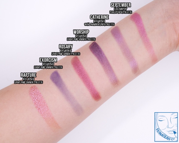
September is described as a metallic pinky violet. This mulberry pink is finely milled with densely packed shimmer. It applies semi-opaque with a rather weak intensity at first, and takes about three layers to build to full coverage and achieve the same degree of vibrancy as in the pan. The product adheres fairly well to my lid and I was able to diffuse the edges easily.
Swatch comparison for September
Revenge is described as a matte red brown. This shade is rather loosely pressed in the pan so my brush was able to pick up a lot of product with only a light touch on the surface. Needless to say, there was a decent amount of kickback in the pan. Almost velvety in texture, Revenge appears burnt red when applied, but turns slightly more brownish when blended out. When used wet, it also becomes a bit patchy. For comparison swatches, please scroll down to the review on Shade.
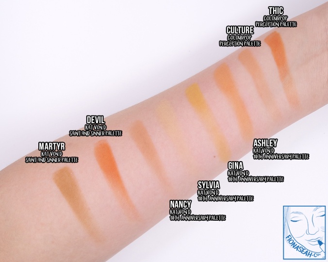
Thic is described as a matte vibrant orange. This warm orange feels much drier as compared to other mattes, thereby rendering it a slightly grittier texture (but it isn’t rough on the lid so not to worry). It applies pigmented but sadly doesn’t blend very well over a large surface area. The intensity and pigmentation of this shade remain largely unchanged regardless of wet or dry application.
Swatch comparison for Thic and Culture
Played Out is described as a matte chocolate brown. This deep cocoa brown can be simply described in one word: problematic. Smooth with great pigmentation and a nearly opaque payoff on the first sweep, this shade was off to a promising start.. until I blended it out – a great deal of intensity and opacity was lost in the process and the finish actually separated on my lid. The harsh edges were a pain to diffuse too. I thought it would be a lot better when applied wet, but it became patchy so.. 🤷🏻♀️
Shade is described as a deep matte purple with violet glitter. This maroon brown contains mostly silver but sparse shimmer. Like Revenge, it has a considerable amount of kickback in the pan due to it being loosely pressed, but it is drier in texture and more coarse to the touch. It goes on slightly streaky on the lid, coating it with a semi-opaque and streaky colour (some of which landed on my face). More product was piled up to build it to full opacity, but to little success. And once it was blended out, it instantly sheered out. That said, Shade may yield better results when used wet.
Swatch comparison for Titus, Revenge, Played Out and Shade
APPLICATION & SUGGESTED LOOK
Culture sets the stage
Applying Culture all over my lids
Played Out goes next
Defining the eyes a little with Played Out
Followed by 14
Further defining the outer V with 14
Stunning Diva picks up the baton
[Pardon my crazy eye] Diva for an added pop on the inner corners
Pick up some I.E. with a finger
Apply I.E. to the centre of the lid
Now, going over to Shade..
Adding some depth along the crease
Dabbing the brush in Stallion
Giving some attention to the lower lash line with Stallion
Extending the application to the next 40% of the lower lash line
OOUUUU! is described as a warm peach with Crème finish. This satin lipstick glides with ease to saturate the lips with a lustrous reddish salmon (orange) colour which is quite a letdown for me because it appears way too peachy than what is depicted in the tube, and anything too peachy makes me look jaundice. Like the other Lux Lipsticks, this is infused with a faint chocolatey scent. Although moisturising, it feels excessively creamy, making it prone to transfer and not as long-wearing as I would like it to be. On top of that, it also tends to leave gaps on the lips and cling onto rough patches.
Swatch comparison for OOUUUU!, against the orange lipsticks I have
C’mon Sis is described as a soft pinky brown with Crème finish. This gorgeous medium brownish-red has the right amount of slip to blanket the lips effortlessly with a moisturising coat of colour that instantly brightens up the face. Richly pigmented, it is opaque in one pass without emphasising the lip lines. A great everyday lip colour for medium skin tones especially, C’mon Sis goes well with any occasion and stays on the lips much longer than OOUUUU!.
Quickie is described as a peachy nude with Crème finish. Touted as the perfect nude lipstick for Black women, this salmon beige goes on smooth to deliver a nearly opaque colour (but buildable to full coverage) with a moisturising sheen on the first swipe. But due to the overly creamy and slippery texture, the product moves quite a bit during application and, of course, doesn’t last very long on the lips.
When I swatched it, the colour seemed lot lighter than what was shown in the swatches provided on the ColourPop website so naturally, I didn’t expect to like it on my lips. But surprisingly, it doesn’t wash me out and it actually complements on skin tone. If you’re planning to amp up the eye makeup, this also makes an ideal lip colour to keep it as the focus. That said, this shade may still be too pale on some skin tones so I recommend pairing it with a mocha brown lip liner to create some depth.
Swatch comparison for Quickie
I am not going to lie – the preposterous amount of beauty influencer collaborations in the market has tamped down my interest in them entirely but this ColourPop × Shayla partnership has definitely brought in some interesting and unpredictable products (I’m so over those warm palettes) – with great value, no less. If there’s anything I’d recommend from this collection, it would be the Perception palette which is probably the most diverse palette ColourPop has ever released.
What are your thoughts about this collection? For those with darker skin tones, do these products really work for you? Let me know your thoughts in the comments below. Otherwise, simply take a quick poll!
Thanks for reading!
ColourPop × Shayla is now available on ColourPop.com.
The rise of social media has prompted trends to move faster than ever, pushing brands to be more adaptive and innovative with the styles, options and products they offer to consumers. But unfortunately, this also means that we have to constantly update our stash of makeup in order to keep up with the speed of change, and doing so can certainly take a toll on our wallets. In this regard, drugstore brands are our saviours – but, admit it, they may not always yield the most satisfactory results.
Hence, to fill the void of affordable yet reliable (and cruelty-free!) cosmetics on the market, Seed Beauty – the same mastermind behind Kylie Cosmetics – developed ColourPop which has been positioning itself as the Forever21 of makeup to enable anyone to follow the latest beauty craze and indulge in quality beauty products without breaking the bank. But as a full-fledge cosmetics company, I’ve always found it strange that ColourPop didn’t have its own line of traditional bullet lipsticks (if you don’t consider the skinny Blotted Lip products as one) – a staple in most makeup bags – until recently when it finally decided to launch the Lux Lipstick range!
My ColourPop Lux Lipstick haul
With over 40 shades to choose from in Crème (creamy-matte) and Matte (velvety-matte) finishes, ColourPop instantly puts established brands that offer far fewer variety to shame. Designed to appeal to our obsession with all things cute, these lipsticks are encased in a star-printed rose gold plastic cylindrical tube (which feels hollow and cheap but I guess that is a trade-off most of us would be willing to accept for affordability) with starry details debossed on the bullet as well.
On top of that, they are also enriched with a wholesome medley of antioxidant-rich extracts such as açaí, jojoba and pomegranate seed butters in the Crème formula, and pomegranate, goji fruit and green seed in the Matte to protect the lips against environmental stressors and premature aging. What’s more, at only US$7 each, you will hardly feel the pinch even if you fill your cart with every shade of the lipstick. So, who says you can’t get A-grade yet non-toxic makeup on a budget?
Note: All swatches (with the exception of comparison swatches) were done with at least 3 passes for opacity check.
Maxed Out is described as a vibrant fuchsia with a matte finish. Contrary to the dry and gritty texture of the bullet (which, I admit, kinda made me suspicious of the result at first), this cool-toned darkened pink actually provides a smooth and even coverage across the lips without stripping away the natural moisture. It has a minimal sheen to it (almost appearing flat), and one swipe is all it takes to give an opaque payoff that doesn’t emphasise the lip lines. This lipstick (as well as the other Mattes I’ve gotten from this line) does smell slightly plasticky when I take a whiff directly from the bullet, but thankfully it dissipates as soon as I apply it to my lips.
Swatch comparison for Maxed Out – Intoxica is lighter and warmer and Catfight is deeper and cooler
Getty is described as a deepened teal, and it is the only one in this review with Crème finish because I hadn’t planned on getting anything from that category until I spotted this unusual shade as I was looking to add another shade to my cart to satisfy the minimum order requirement for free international shipping. Scanning through the swatches on the ColourPop website, I had my reservations about how it wears, but this turns out to be one of my best buys from the brand.
Apart from being absolutely stunning with a faint chocolatey scent, the slip of this bluish-teal is fantastic. Gliding on like a dream, it delivers a full, even coverage with a lustrous appearance which reflects light, making imperfections less visible while moisturising the lips. If the sheeny wet look isn’t your cup of tea, it can be blotted off without taking too much intensity away from the colour or cause it to look blotchy. It does, however, settle deep into the lip lines and leave a subtle blue stain upon removal, so I would advise against using this anywhere else besides the lips. In terms of longevity, this definitely doesn’t last as long as the Mattes.
And no, your eyes didn’t play tricks on you – this lipstick really is longer than the Mattes by about 0.3 cm even though they have the same net weight.
ColourPop Matte Lux Lipstick in Trill Seeker (US$7)
ColourPop Matte Lux Lipstick in Trill Seeker
ColourPop Matte Lux Lipstick in Trill Seeker
ColourPop Matte Lux Lipstick in Trill Seeker
ColourPop Matte Lux Lipstick in Trill Seeker
ColourPop Matte Lux Lipstick in Trill Seeker
Trill Seeker is described as a true periwinkle with a matte finish. This mid-tone lavender blue has a powdery smooth texture which goes on pigmented and evenly on the lips without any causing any patchiness or drawing attention to the lip lines. The payoff is slightly sheer on the first swipe, but it is buildable to full opacity upon the third. It contains the right amount of wax and oil to create such flat yet non-drying effect. However, the colour tends to skip on smaller surface so it was a bit challenging for me to line my cupid’s bow and inner corners.
ColourPop Matte Lux Lipstick in Confetti Cake (US$7)
ColourPop Matte Lux Lipstick in Confetti Cake
ColourPop Matte Lux Lipstick in Confetti Cake
ColourPop Matte Lux Lipstick in Confetti Cake
ColourPop Matte Lux Lipstick in Confetti Cake
ColourPop Matte Lux Lipstick in Confetti Cake
Confetti Cake is described as a vibrant teal with a matte finish. Like Trill Seeker, this cool turquoise isn’t for the faint-hearted but if you’re feeling a little ballsy, this will turn out so gorgeously on the lips, especially when blended into Getty! Non-drying with just a hint of sheen, it evenly deposits a soft and smooth layer of product on the lips without emphasising the lines. This shade also effortlessly gives a highly pigmented and opaque coverage which makes achieving clean, crisp lines around the lips a cinch.
Mind Trick is described as a brick red with a matte finish. A superb alternative to boring reds, this warm orangey brown lays down a load of pigment in just one swipe, providing a smooth and even consistency that remains hydrating over time. Creamy and velvety in texture, this shade has an opaque coverage which, even though feels like a lot of product, sits comfortably on my lips without gravitating towards the lines.
ColourPop Matte Lux Lipstick in Money Moves (US$7)
ColourPop Matte Lux Lipstick in Money Moves
ColourPop Matte Lux Lipstick in Money Moves
ColourPop Matte Lux Lipstick in Money Moves
ColourPop Matte Lux Lipstick in Money Moves
ColourPop Matte Lux Lipstick in Money Moves
ColourPop takes a leaf out of Cardi B’s book to produce Money Moves, a medium reddish-brown described as a muted terracotta with a matte finish. In case you’re not in tuned with pop music, this lipstick is named after the lyrics of her (no offence) awfully-sounding chart-topping single “Bodak Yellow”. But as much as I hated that song, Money Moves is another shade I have to sing praises for because of how smoothly it applies across the lip to give a rich and opaque colour payoff. Lightweight and long-wearing, this shade has a creamy and velvety texture like the rest of the lipsticks mentioned in this post, and works fabulously well on all skin tones.
Swatch comparison for Money Moves
Wow.. just wow. I don’t know how ColourPop does it but the formula for the Lux Lipstick line is beyond ah-ma-zing for the price. I have no particular favourite from this haul because practically every one of them (especially the more unconventional shades since I’ve had terrible experiences with similar ones by other brands in the past) has exceeded my expectations. The Mattes took me by surprise their non-drying yet insanely pigmented finish, and the colours on the lip are true to the colours in the tube. And at only US$7 each for all the R&D involved in formulating these gems? I’m starting to wonder if ColourPop is deliberately making a loss to save us from the overpriced makeup out there!
What are your thoughts about the Lux Lipsticks? Let me know your views in the comments below or take a quick poll!
Thanks for reading!
ColourPop Lux Lipsticks are now available on ColourPop.com.


![[Pardon my crazy eye] Diva for an added pop on the inner corners](https://fionaseah.com/wp-content/uploads/2018/07/colourpop-shayla-perception-eyeshadow-palette-7.jpg?w=676&h=541)


