Hello everyone!
Each year, M·A·C graces us with collaborations with adored names from popular culture, some having almost no relevance to the beauty world. Before 2017 came to a close, they surprised us with yet another unexpected partnership, although this time with one bearing a last name that would ring a bell even if not acquainted with the Rock ‘n’ Roll scene in the 60s and 70s – all thanks to Maroon 5 and Christina Aguilera.
Notably known as the daughter of Mike Jagger, the lead singer of the legendary rock band Rolling Stones (and also the subject of the song “Moves Like Jagger”), Jade Jagger spent her glamorous childhood surrounded by celebrities including late pop artist Andy Warhol who often babysat her following her parents’ divorce. But in spite of her privileged upbringing, she would then go on to make a name for herself as an esteemed jewellery designer, occasional model and a socialite.

Recognising that jewels and makeup are an essential part of a woman’s ritual when getting dressed, she brought her “gemstone proclivities and free-spirited sensibilities” (while paying tribute to her Rock ‘n’ Roll heritage) to her first collaboration with M·A·C and created a capsule makeup collection of luxurious jewel tones and deep metallics.
Launched last December, the eight-piece collection includes lipsticks (Opal Beach, Sunset Pearl and Rolling Red), eye shadow quads (Burning Nights and Golden Shine) a blush (Moon Shimmer and Perfect Bronze) and highlight (Satin Shimmer) – all of which fall under the brand’s Mineralize Rich range (which was one of Jagger’s top preferences for containing natural pigments) and complete with glitzy yet edgy gold and black packaging to complement her jewellery line.
Take a look at the collection (photographed during the launch here at M·A·C ION Orchard) below:

The display

Swatches for all lipsticks in the M·A·C × Jade Jagger collection

Swatches for bronzer and blush in the M·A·C × Jade Jagger collection

Swatches for Burning Lights eye shadow quad (those of Golden Shine will be shown later in the review). I was initially planning to get this but the blue really disappointed me. The colour when swatched was nowhere near the vibrant blue on the palette (it actually looks like grey?) and it had a messy, talc-like consistency. Nope.
As per what is expected of the Mineralize range, this collection features packaging with a magnetic closure and, in the case of the eye shadow, a mirror (which, in my opinion, is too small and set too far into the lid to be practical for my beady, short-sighted eyes) and is significantly pricier than usual because of the nourishing ingredients and technology that go into formulating them.
But on the downside, the steeper price tag has also been a deterrent for me to purchase anything from the Mineralize line, which is why it is hardly talked about here despite me being a considerably fervent supporter of M·A·C. Hence, much as I really liked the Haute Dogs collection, I didn’t feel propelled to buy anything because I couldn’t justify paying almost double the price for what could be found in the regular line. Likewise, when I knew this collaboration was going to be sold under the Mineralize umbrella, I was already prepared to pass on it altogether.
Then came the invitation to the launch event which coincided with the first year anniversary of the opening M·A·C ION Orchard in December. In celebration of the milestone, event attendees were given M·A·C shopping vouchers (among many other freebies) and I gladly spent them on Mineralize Eye Shadow in Golden Shine and Mineralize Rich Lipstick in Sunset Pearl 😆

My picks!
Mineralize Eye Shadow X 4: Golden Shine

M·A·C × Jade Jagger Mineralize Eye Shadow X 4 in Golden Shine (US$46 / S$)

M·A·C × Jade Jagger Mineralize Eye Shadow X 4 in Golden Shine

The eye shadow quad comes with a protective film over it

M·A·C × Jade Jagger Mineralize Eye Shadow X 4 in Golden Shine

M·A·C × Jade Jagger Mineralize Eye Shadow X 4 in Golden Shine

Swatches applied with wet and dry brushes
A powder formula of refined baked minerals, Golden Shine promises ultra-lightweight coverage in four coordinated warm non-matte shades including a soft champagne gold, rose gold, bright copper and deep reddish brown. According to M·A·C, unlike traditionally pressed shadows, each of the shadows in this palm-size (easy to carry around) palette is moulded into small round terracotta tiles (like little hemispheres) measuring less than 2 cm in diameter and presented à la CHANEL (think Les 4 Ombres palette) which I am not a fan of because it looks rather old-fashioned.
Infused with Mineral-rich Yeast Extract – a Multi-Mineral Complex which purportedly nourishes while providing silky-smooth, buildable coverage, the eye shadows are carefully baked for 24 hours to allow for an exceptionally sheer and light application. M·A·C recommends that they be applied dry for low to medium coverage with a shimmery finish, or wet (with setting spray such as M·A·C Prep + Prime Fix+ instead of water for better results) for more intense coverage and colour. If you intend to use them wet, do make sure you only moisten the brush after dabbing it into the eye shadow to prevent the pan from becoming wet (which can subsequently cause mold!).
Soft champagne gold is a brightened, light-medium gold with yellow undertones and a frosted sheen. When applied dry, the glitter particles are sparse and the texture feels gritty. The payoff is sheer yet easy to blend, making it a great alternative to face highlighter (so you won’t have to make space for a highlight compact in your cosmetics bag!). The shimmers are more well-distributed when wet, and they capture light better to deliver even more radiance. The eye shadow also has greater buildable coverage when used with a dampened brush.

Swatch comparison for soft champagne gold
Rose gold is a medium reddish brown with a shimmery finish. Its shimmer particles are much more fine with a looser consistency and these factors contribute to its uneven (but buildable) consistency. Thus when applied as is, it falls out. However, the moment the eye shadow interacts with a speck of water, the particles pack densely together and the colour also appears deeper with a visibly opaque payoff. On top of that, application becomes a lot smoother and edges can now be diffused rather easily. For these reasons, I feel this shade performs better when applied with a dampened brush.

Swatch comparison for rose gold
Bright copper (presumably, because no matter how I look at it, it does not look like copper to me) is a gaudy medium-deep gold with brown undertones and a frosted sheen that has the potential to transform into metallic with more pressure is applied to it. The payoff for this shade is almost identical when dry and wet. In both instances, it delivers a smooth and silky consistency and a highly pigmented and opaque finish with about two layers, coupled with very densely packed particles and a buildable coverage. Perhaps one distinction when applied wet is that the texture tends to stiffen slightly, causing the edges not to blend out very well.

Swatch comparison for bright copper
Deep reddish brown is a blackened brown with pink shimmers that are thinly dispersed. That said, this shade has noticeably less shimmers that are not as obtrusive as the others. Without moistening, the first few layers give a semi-sheer, soft and blurred finish. But once it gets slightly wet, the edges become more well-defined – which, on the downside, doesn’t allow for easy blending – while greatly intensifying the colour payoff and opacity.

SAMSUNG CAMERA PICTURES
APPLICATION & SUGGESTED LOOK
For a more accurate depiction of the eye shadows’ payoff in this review, they are used in their unaltered form without any wetting agent to create the suggested look below.
![[BEFORE] As always, I primed my lids before applying eye shadow](https://fionaseah.com/wp-content/uploads/2018/02/mac-jade-jagger-mineralized-eye-shadow-x4-golden-shine-7.jpg?w=676&h=541)
[BEFORE] As always, I primed my lids before applying eye shadow

Look how small the palette is!

Rose gold as the base colour

Blend it with soft champagne gold to create a little ombré effect towards the brows

Fill the creases with bright copper

Add additional layers of bright copper to make it pop. Make sure to blend it with the rose gold above

Apply bright copper to the waterline

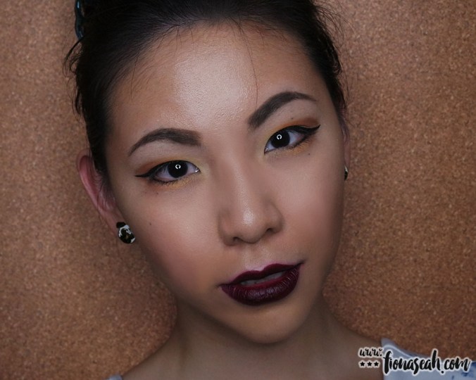
Complete the look with deep reddish brown to add some depth
![[AFTER] The result](https://fionaseah.com/wp-content/uploads/2018/02/mac-jade-jagger-mineralized-eye-shadow-x4-golden-shine-14.jpg?w=676&h=541)
[AFTER] The result

A closer look

With eyeliner
In general, the eye shadows, apply a lot less chalky than expected and they adhere to the lids fairly well even when dry. That said, they have a looser consistency than traditional ones and can generate a bit of a mess as they tend to kick up more product than necessary when I dip my brush into the pans (so I had to keep wiping away the fallout on the palette after every use). Furthermore, being mostly complementary colours, there won’t be much of a dramatic contrast between any of the two neutrals but this also makes it ideal for fail-proof everyday definition.

Aftermath…
Lipstick: Sunset Pearl

M·A·C × Jade Jagger Mineralize Rich Lipstick in Sunset Pearl (US$25 / S$)

M·A·C × Jade Jagger Mineralize Rich Lipstick in Sunset Pearl

M·A·C × Jade Jagger Mineralize Rich Lipstick in Sunset Pearl

M·A·C × Jade Jagger Mineralize Rich Lipstick in Sunset Pearl

M·A·C × Jade Jagger Mineralize Rich Lipstick in Sunset Pearl

M·A·C × Jade Jagger Mineralize Rich Lipstick in Sunset Pearl
Sunset Pearl is described as a midtone rosey brown in Mineralized finish. A limited edition shade, it is specially formulated to be lightweight with nourishing properties to condition the lips with maximum moisture. This reddish beige glides comfortably on the lips like butter to coat every contour and fine line with semi-sheer coverage. But because it isn’t entirely opaque, it does not provide enough pigment to conceal rough patches substantially and adding additional layers will only amplify their texture even more (as the rough patches will seem a lot darker than other areas). Therefore, it will be advisable to exfoliate the lips before application.
Buildable to a deeper, more opaque colour, this lipstick has emollient and hydrating effect, leaving the lips soft and supple. Since starting on Oratane about a month ago, my lips have been exceptionally prone to chapping and this actually manages to keep my lips from flaking further within the first three hours of wear (until I have my meal, basically). A pretty neutral that is not too light and not too heavy, this shade does a phenomenal job in bringing out the sparkle of the colours layered over the lids using the Golden Shine palette!

Swatch comparison for Sunset Pearl
Although the collection is no longer stocked in stores, it is still available on MAC Cosmetics website in very limited quantities (as the last time I checked, the eye shadow quads have been taken down already), so hurry and snatch up your favourites before they are gone for good!
What do you think about this collection? Let me know your thoughts in the comments below or simply take a poll!
Thanks for reading!
M·A·C × Jade Jagger is now available on MACCosmetics.com and was sold in all local M.A.C outlets.
Follow me on Instagram and Facebook for bite-sized beauty updates!