Hello everyone!
Continuing from where the previous ColourPop × My Little Pony collection review ended last week, here’s the second post where I will talk about some of the face and lip products from the same haul.

Let’s begin with the highlighters!
Housed in a purple compact with an integrated mirror and a magnetic closure, the highlighters in the ColourPop × My Little Pony collection are about the size of an adult palm with a net weight of 6.5 g (0.23 oz) each. Made in the U.S. with stars embossed on the surface, the highlighters are available in two shades – Starflower and Trickles – and I’ve got them both here in this review.
Like the eye shadow palette, the motifs on the compact don’t quite appeal to me and I find the workmanship for this collection to be rather shoddy and lazy. In particular, Starflower arrived with slight dip in the bottom bit of the product as if it was not properly filled and pressed in the pan. Loose product was scattered all around the pan when I opened the case and it even dirtied the mirror. That said, I must consider myself lucky enough for not receiving a totally shattered ColourPop highlighter considering how fragile they are according to the reviews on their website!
The names of the highlighters are also printed in black on see-through stickers that are pasted on the most inconspicuous part of their respective boxes (not the compact). Hence, unless you manually write them on the compact, you’d need to keep referring back to the boxes for their names (and you cannot lose them).
Now, onto the critique of the products themselves.
#1 Pressed Powder Highlighter in Starflower

ColourPop × My Little Pony Pressed Powder Highlighter in Starflower (US$8)

ColourPop × My Little Pony Pressed Powder Highlighter in Starflower

ColourPop × My Little Pony Pressed Powder Highlighter in Starflower

ColourPop × My Little Pony Pressed Powder Highlighter in Starflower

ColourPop × My Little Pony Pressed Powder Highlighter in Starflower

ColourPop × My Little Pony Pressed Powder Highlighter in Starflower

ColourPop × My Little Pony Pressed Powder Highlighter in Starflower

ColourPop × My Little Pony Pressed Powder Highlighter in Starflower (two swipes)

ColourPop × My Little Pony Pressed Powder Highlighter in Starflower
Starflower is described as a peachy gold with a finish being more metallic than glittery. Finely milled, this highlight is mostly sheer with very limited buildability. Also, perhaps because it is rather similar to my natural skin colour, it isn’t very prominent on my skin. This would be ideal if you are going for a soft glow or prefer something that isn’t too blinding. But personally, I was a little underwhelmed by it 😫 The first swipe rendered little to no reflective quality and it appears a bit chunky on my cheekbones as it tends to emphasise the pores and texture of my skin. This probably will work better on darker skin tones.
#2 Pressed Powder Highlighter in Trickles

ColourPop × My Little Pony Pressed Powder Highlighter in Trickles (US$8)

ColourPop × My Little Pony Pressed Powder Highlighter in Trickles

ColourPop × My Little Pony Pressed Powder Highlighter in Trickles

ColourPop × My Little Pony Pressed Powder Highlighter in Trickles

ColourPop × My Little Pony Pressed Powder Highlighter in Trickles

ColourPop × My Little Pony Pressed Powder Highlighter in Trickles

ColourPop × My Little Pony Pressed Powder Highlighter in Trickles

ColourPop × My Little Pony Pressed Powder Highlighter in Trickles (one swipe)

ColourPop × My Little Pony Pressed Powder Highlighter in Trickles
Trickles is described as a lavender with pink opal duochrome flip. This was added to my cart on a whim to meet the minimum threshold for free international shipping but I ended up enjoying it more than Starflower. Trickles has a soft and metallic finish and is fairly blendable on the skin. It does not share the same formula as the Super Shock Highlighter so expect neither a blinding glow nor an intense pigmentation from it. However, if you prefer a more subtle dewy look, this is the shade you should pick up.
Trickles appears more luminous than Starflower and adds a subtle bounce of light to the cheekbones. For me, I do not have to build up much to see the holographic shift (and besides, my room isn’t the most well-lit of places so to be able to even see colour payoff from any highlighter is already a massive plus). Without having to scrape the top layer, I just need to sweep the brush over my cheekbones twice for the highlighter to pop. I recommend this stunner over Starflower any day!

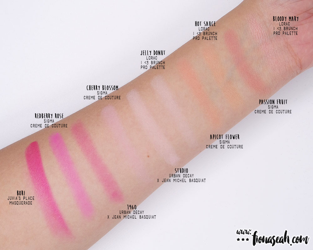
Compare ColourPop Starflower and Trickles with other highlighters
Moving on to the lips..
#3 Ultra Matte Lip in Lemon Drop

ColourPop × My Little Pony Ultra Matte Lip in Lemon Drop (US$6)

ColourPop × My Little Pony Ultra Matte Lip in Lemon Drop

ColourPop × My Little Pony Ultra Matte Lip in Lemon Drop

ColourPop × My Little Pony Ultra Matte Lip in Lemon Drop

ColourPop × My Little Pony Ultra Matte Lip in Lemon Drop

ColourPop × My Little Pony Ultra Matte Lip in Lemon Drop

ColourPop × My Little Pony Ultra Matte Lip in Lemon Drop

ColourPop × My Little Pony Ultra Matte Lip in Lemon Drop
Apart from the additional whimsical detail on the tube (which I quite like), the packaging of the lip products in this collaboration did not deviate much from those in the permanent line. There are a total of six lip products in this My Little Pony collection with three being the Ultra Glossy Lips (Ponyland, Dream Castle & Flutter Valley) – which were a hard pass for me since I’m not a fan of glossy finish – and the rest Ultra Matte Lips (Lemon Drop, Pin Wheel & Moondancer). I have always been a strong advocate of dark lips but this time, I wanted something I don’t already have hundreds of dupes of in my stash 🤨
Lemon Drop is described as a bright cool-toned lavender. This shade darkens as it sets and eventually becomes less pastel and somewhat of a royal purple with a flat-matte and shine-free finish. Bold yet universally flattering (especially on darker skin tones), this shade has a creamy and thick consistency and is absolutely transfer-proof. Lemon Drop saturates the lips with uniform opaque colour that locks into place in just one swipe. It dries down almost instantly and does not settle into the creases of the lips. Although it can feel slightly drying, it doesn’t crack on the lips. However, it has the tendency to flake off after a few hours of wear. When removed, it leaves a pinkish tint on the lips which I honestly don’t mind at all 😆

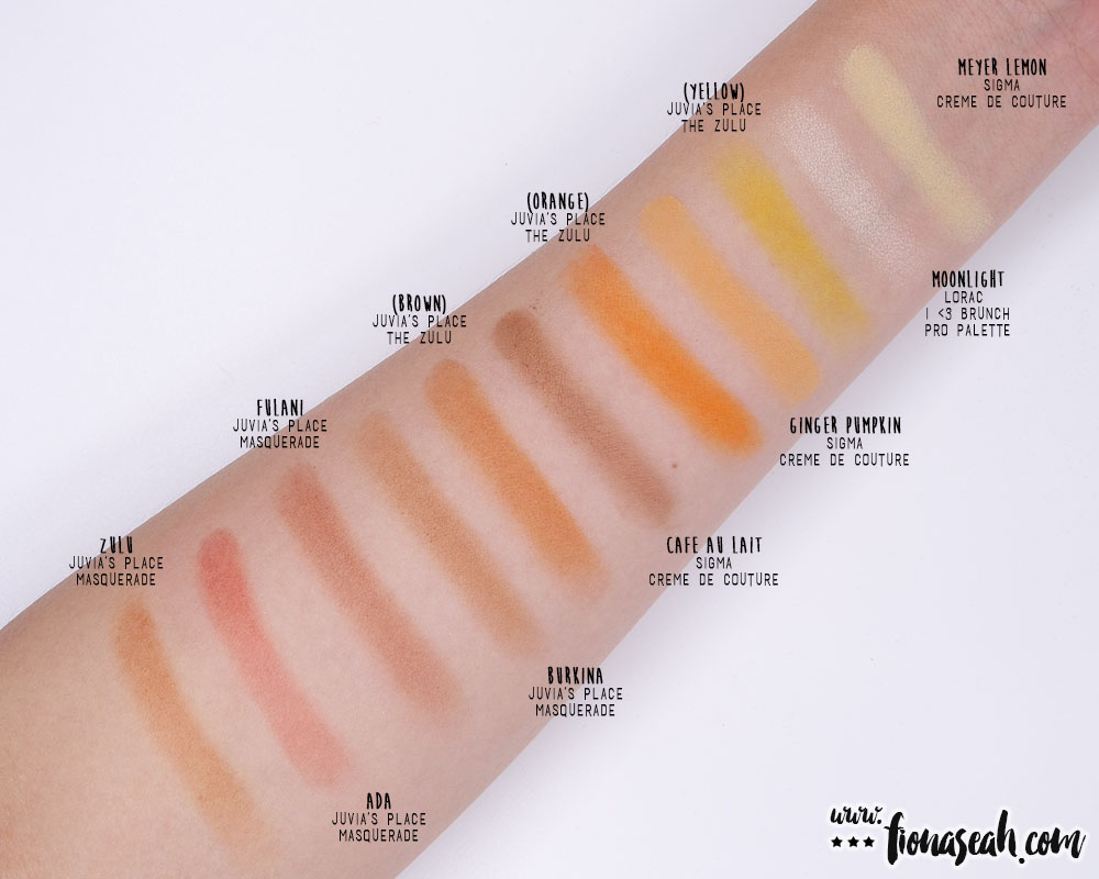
ColourPop Lemon Drop swatch comparison
#4 Ultra Matte Lip in Pin Wheel

ColourPop × My Little Pony Ultra Matte Lip in Pin Wheel (US$6)

ColourPop × My Little Pony Ultra Matte Lip in Pin Wheel

ColourPop × My Little Pony Ultra Matte Lip in Pin Wheel

ColourPop × My Little Pony Ultra Matte Lip in Pin Wheel

ColourPop × My Little Pony Ultra Matte Lip in Pin Wheel

ColourPop × My Little Pony Ultra Matte Lip in Pin Wheel

ColourPop × My Little Pony Ultra Matte Lip in Pin Wheel

ColourPop × My Little Pony Ultra Matte Lip in Pin Wheel
Pin Wheel is described as a vibrant cool-toned fuchsia. It is an alluring cool-toned hot pink that is guaranteed to grab eyeballs and earn you compliments. Extremely pigmented, this shade provides an intense and opaque colour in one application. It has a more watery consistency than Lemon Drop so it takes a while to completely dry down. Velvety in texture, it is neither drying or hydrating and wears comfortably lightweight. It settles to a flat matte without constricting the lips and the colour remains true to what you see in the tube. On top of it being totally transfer-proof and long-lasting. it also does not emphasise lip wrinkles. Honestly, there is really nothing much to gripe about this lovely lipstick!

ColourPop Pin Wheel swatch comparison
Once again, ColourPop proves that you don’t have to burn a huge hole in your pockets for quality makeup and licensed products can still be affordable (*cough*Storybook Cosmetics*cough*). If you’re still contemplating if you should get any of the items featured above, seriously? JUST DO IT.
Furthermore, Black Friday sale is on now (til 25 November 2017 11.59 PM PST) and you can get to buy the Ultra Glossies and Mattes for less. Instead of US$6, they are going for US$4 each. ColourPop is also throwing in free global shipping for orders over US$50. So what are you waiting for? Chop-chop kali pok 😆
What do you think about the highlighters and the liquid lipsticks in this collection? Let me know your thoughts in the comments below or take a quick poll!
Thanks for reading!
The ColourPop × My Little Pony collection is now available on ColourPop.com.
Follow me on Instagram and Facebook for bite-sized beauty updates!